Designing the phone number transfer feature in-app, enabling new customers to start, track, and receive updates on their number transfer—all within the same device
Client
Role
Lead product designer
Year
2025
Platform
Mobile app
Background
For new TELUS customers, porting in an existing phone number is the most important flow during onboarding, ensuring that they start their new service on their existing number. Customers on their mobile device who want to transfer their phone number to TELUS are currently redirected to the mobile web experience. The mobile web experience is not optimized in terms of user experience, adding friction to the customer's goals. As the lead designer, I worked on improving the user experience of the existing transfer flow from the web experience, while optimizing the interface and technologies as a new native app experience to start, track, and receive updates on transfers.
Impact
By enabling customers to start, submit and track their transfer on one device, post launch analytics showed that customers were more likely to submit a transfer and successfully confirm their transfer.
Conversion rate
15%
Year-over-year conversion:
+440%
Completions
1027
Port-in completions
User friction and research insights
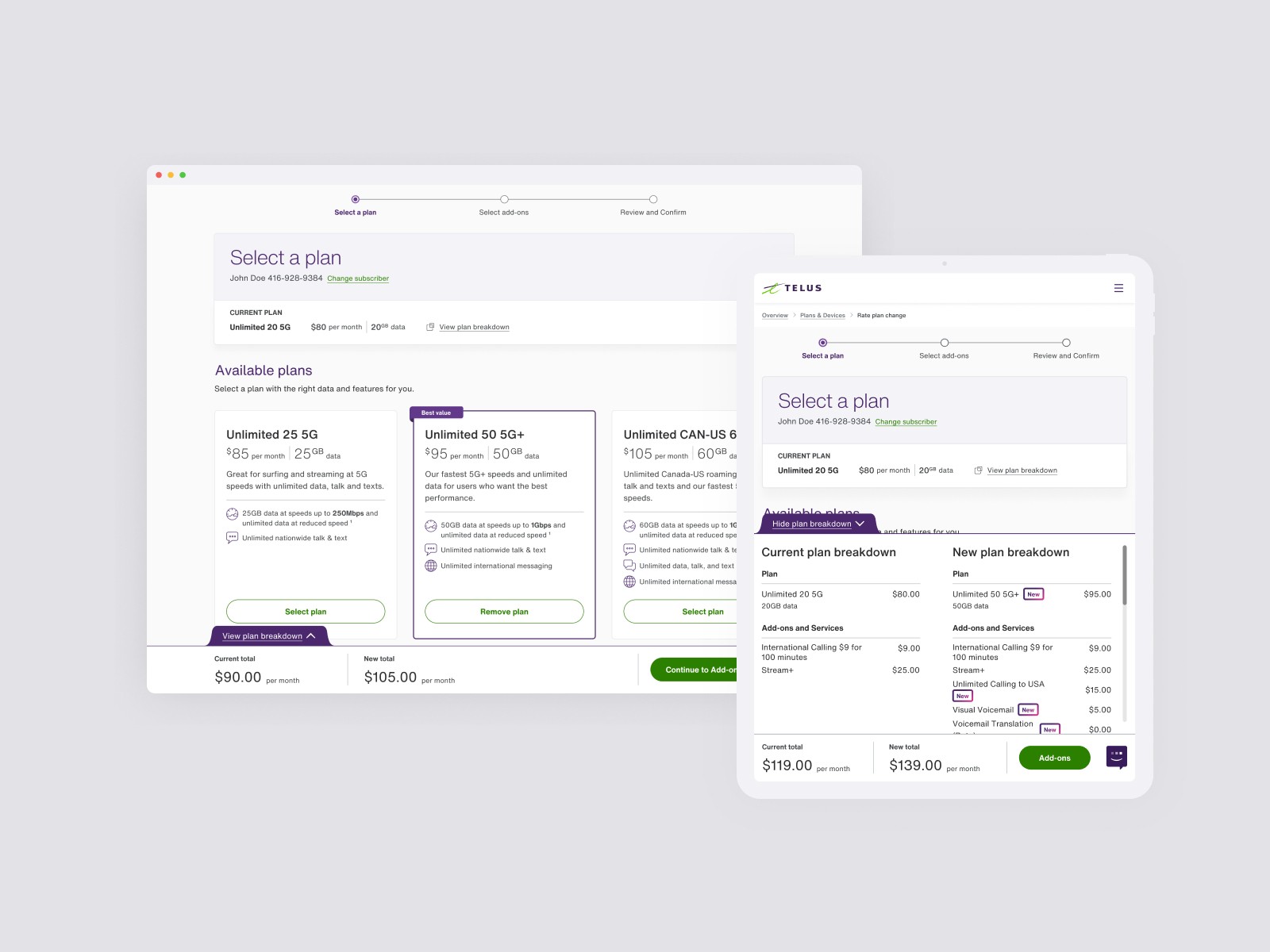
In the existing experience, customers who want to transfer their number are led into a mobile web experience. Because of this, the flow was not optimized for a mobile phone usage, resulting in poor conversions.
The analytics reveal that customers were facing issues in starting and completing their requests. The current drop-off rates for app were at 23%. Through analyzing error rates, we identified the main pain points as:
Poor performance of mobile web cross-link, as the experience was not within the native app.
Difficulty in understanding what information is needed to submit a transfer, and where to find it (eg. old account number from past provider, or the device's IMEI number)
Lack of clarity on how to complete transfer from SMS. Transfers are timed out within 90 minutes of a transfer request.
Cross-functional alignment
Redesign goals
1
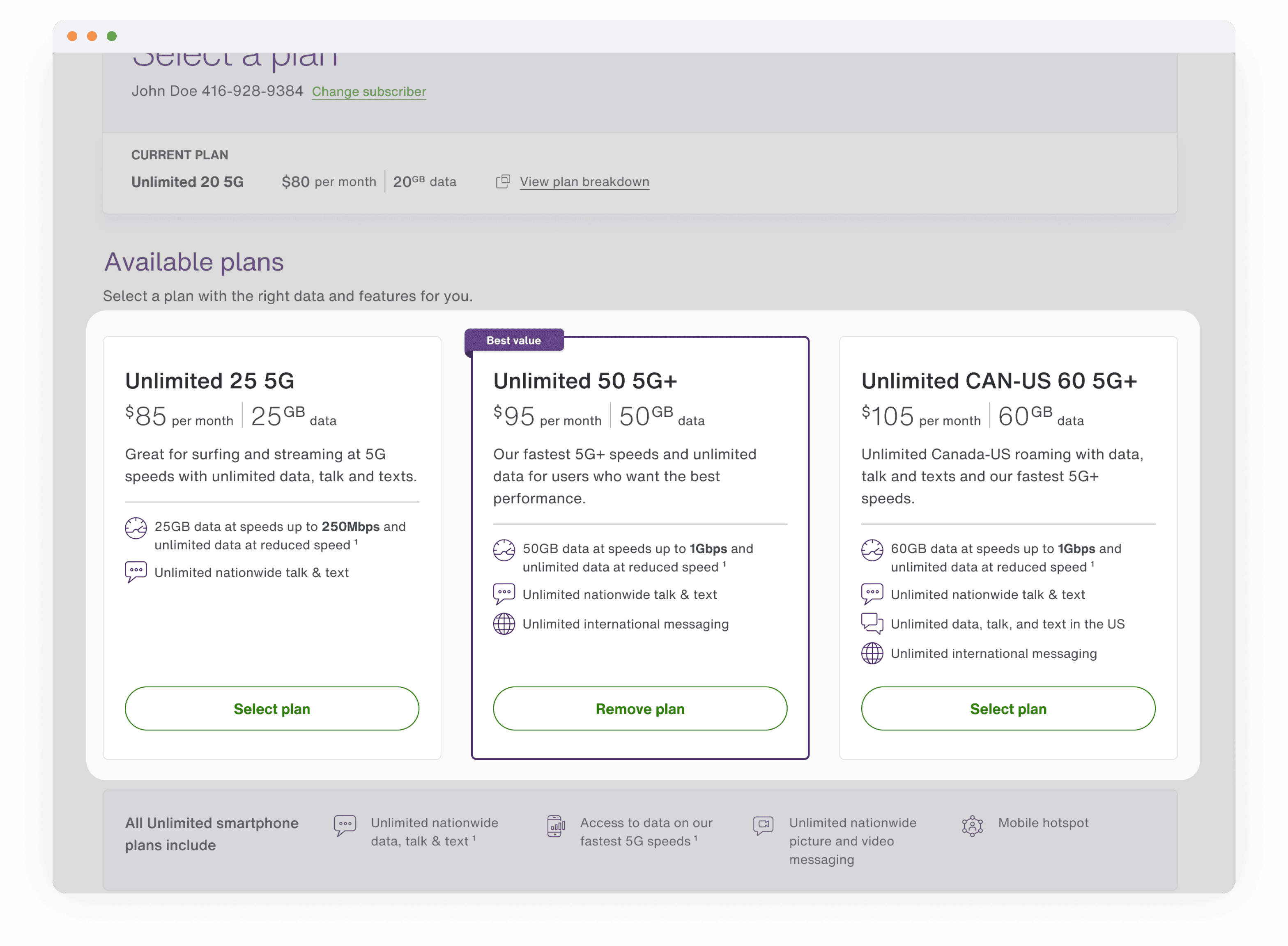
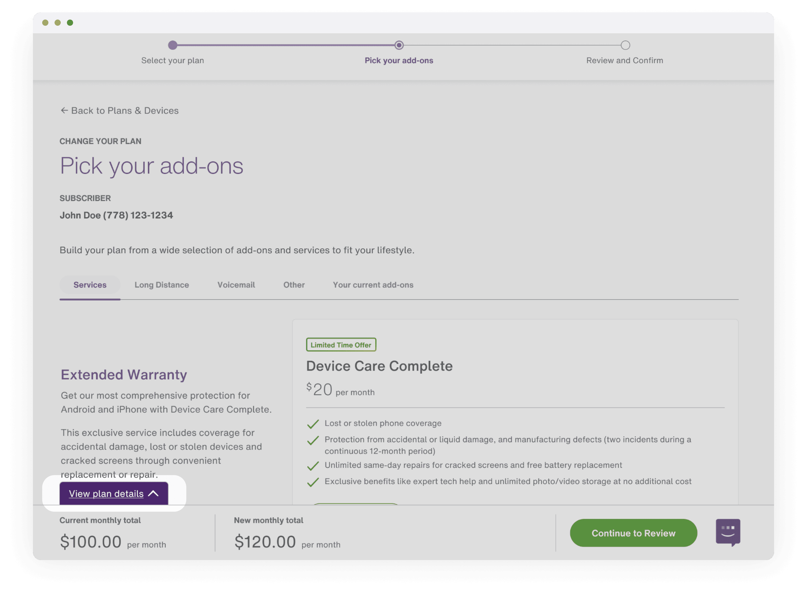
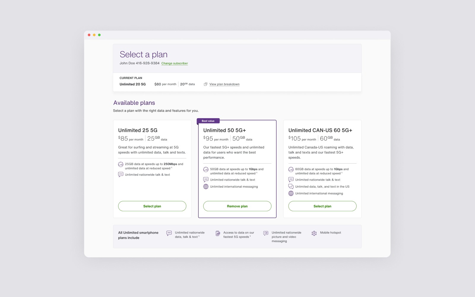
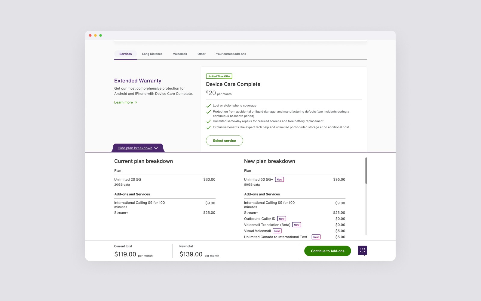
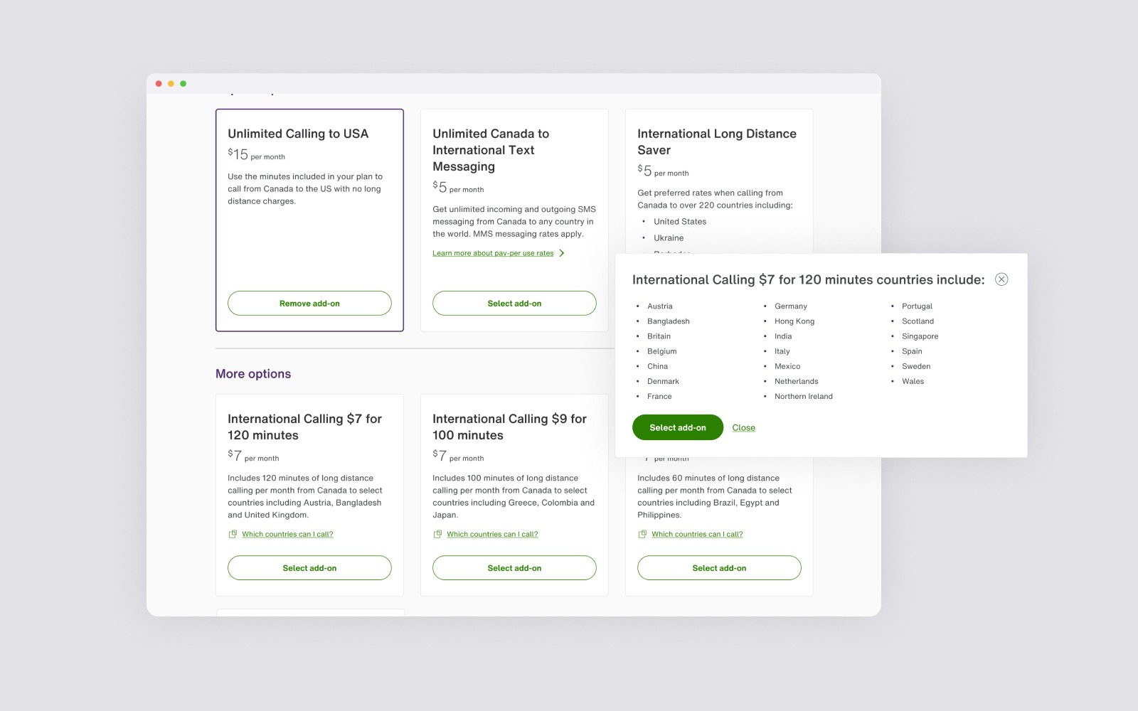
Surface details for customers to assist with finding and comparing specific rate plans and add-ons
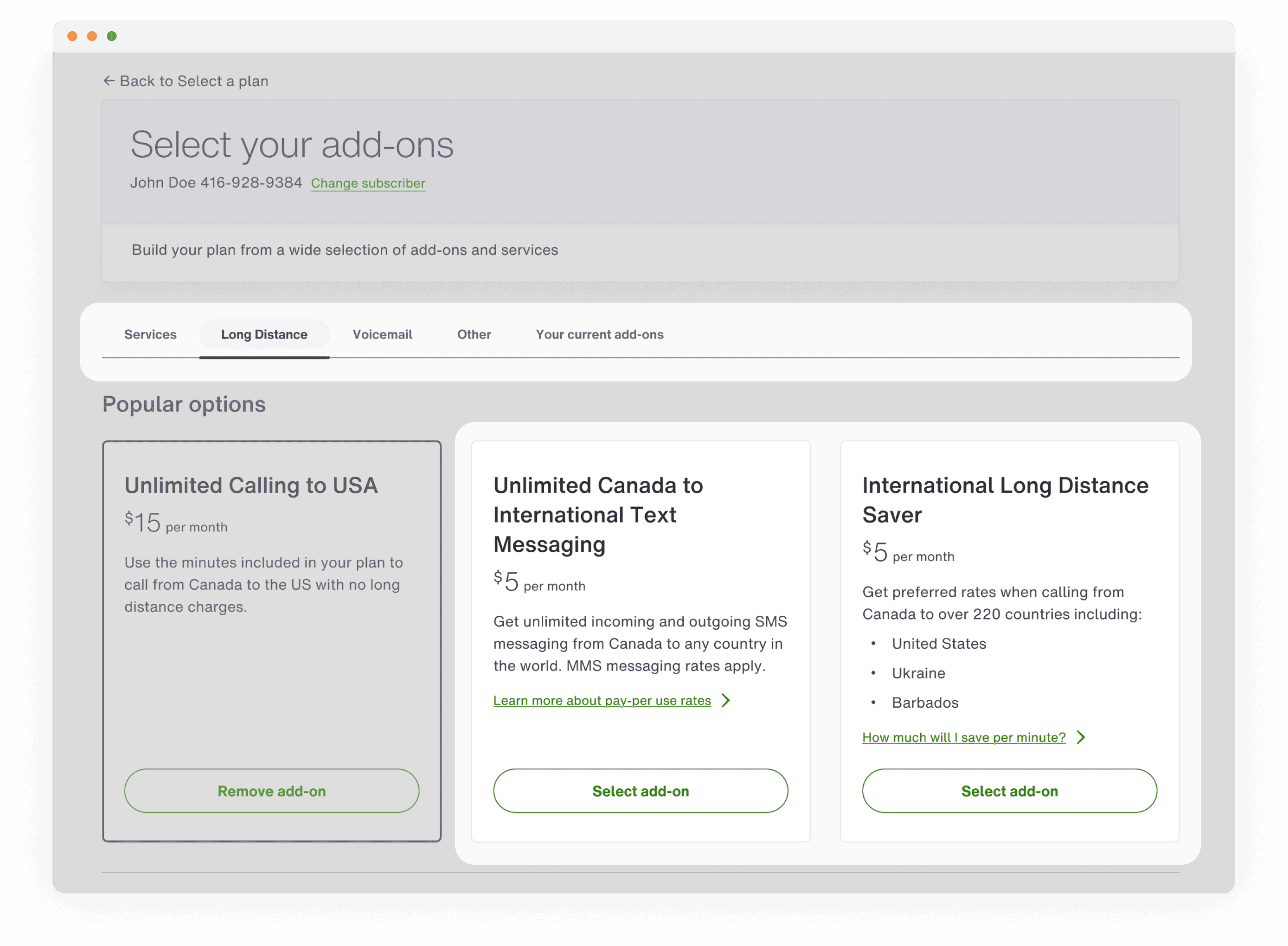
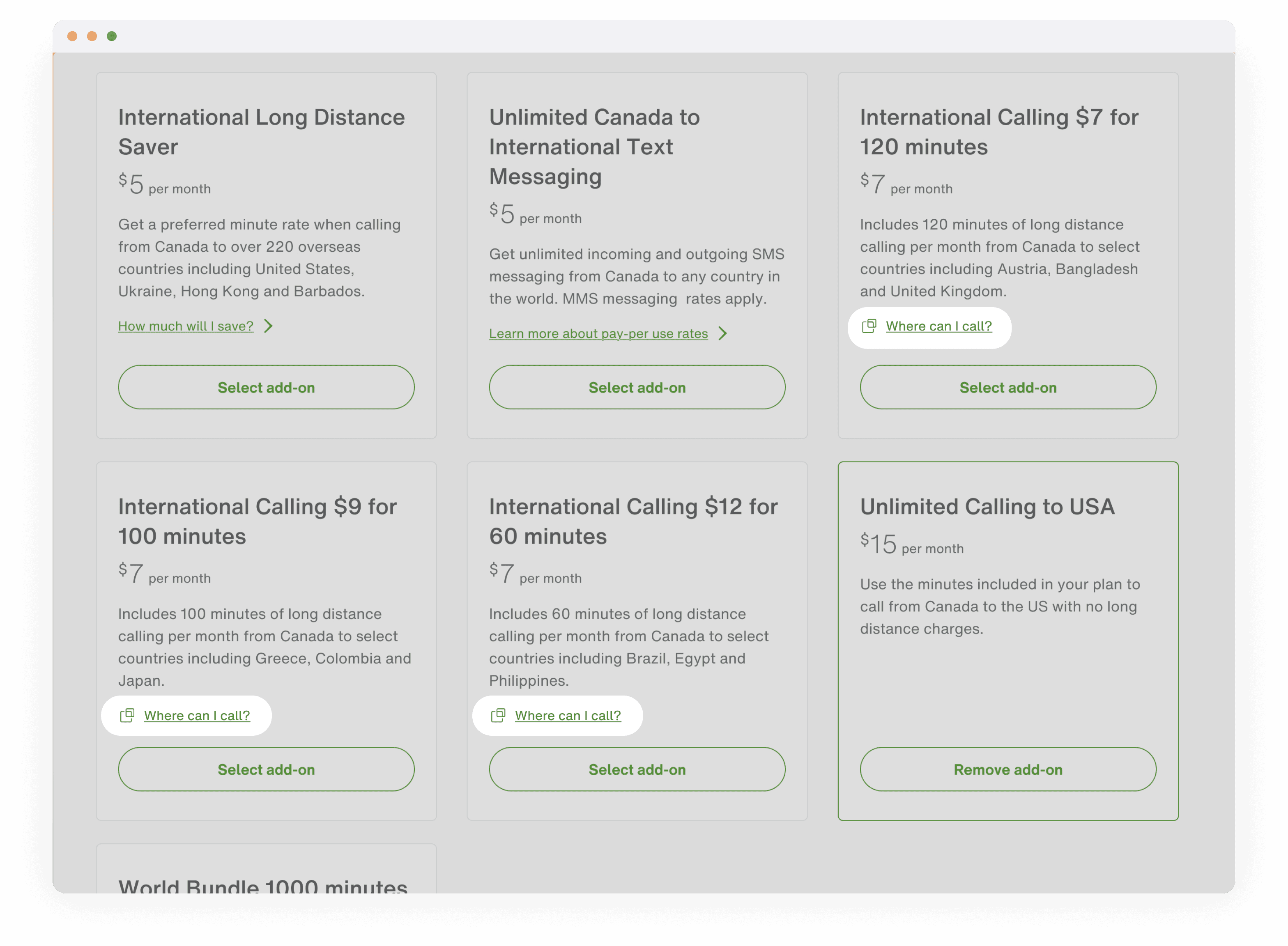
2
Improve add-on information architecture to match customer expectations for how add-on options should be grouped
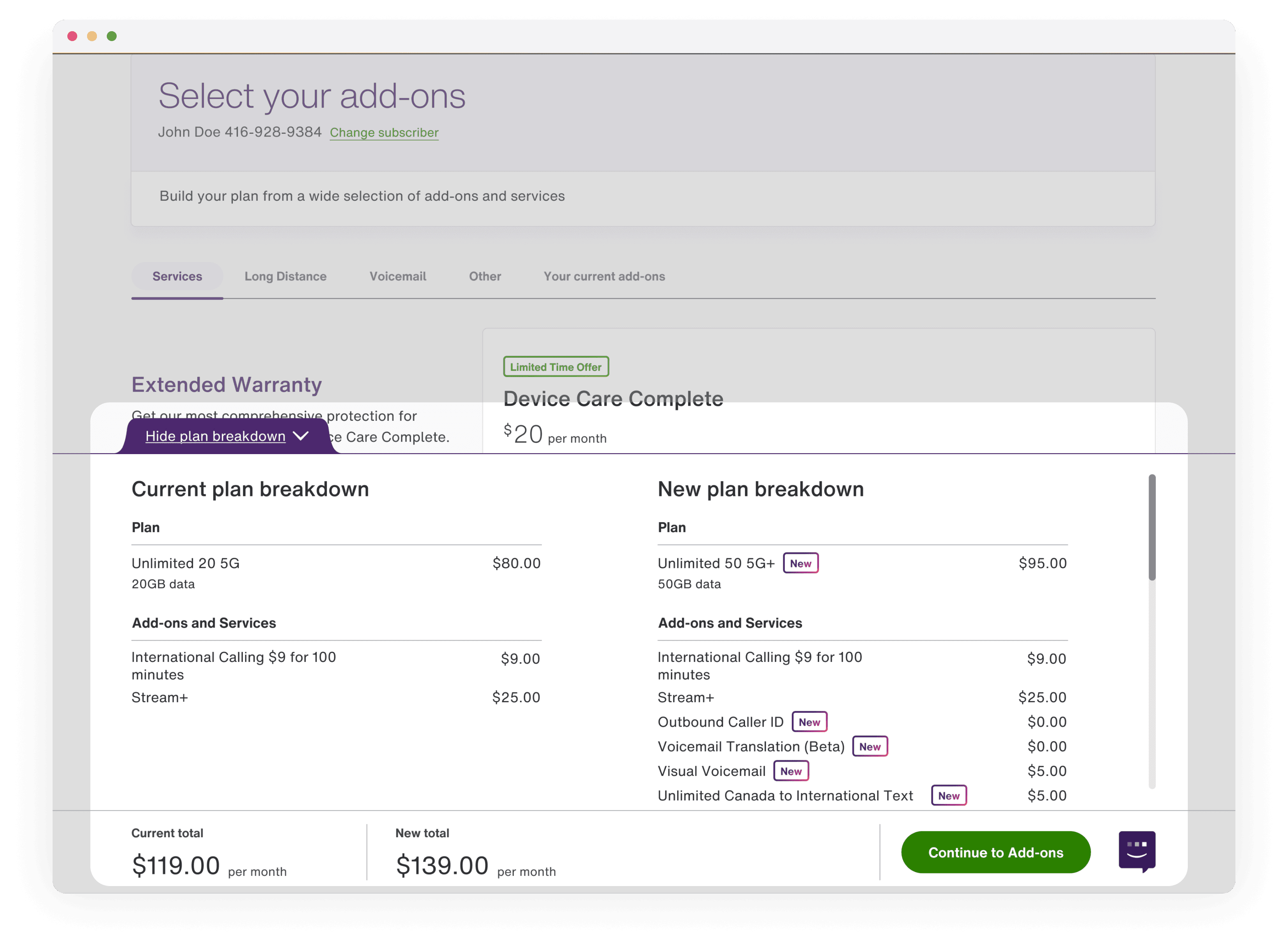
3
Allow customers to be able to easily understand differences difference between potential option and current selection
Design intervention


User testing validation
We ran an unmoderated usability test to evaluate whether users found the redesigned experience more intuitive for completing common tasks. Results showed strong improvements with the redesign, while highlighting two areas of improvement to increase the discoverability of add-on details and the comparison footer.
Design launch
Reduce friction to start the process
By creating a native in-app flow, the load time to enter the experience decreased from 15 seconds to ~2 seconds, while the number of taps to enter the flow was reduced from 3 taps to 1 tap. On the first step, users are able to preview what kind of information they need, giving them context earlier of what to expect.
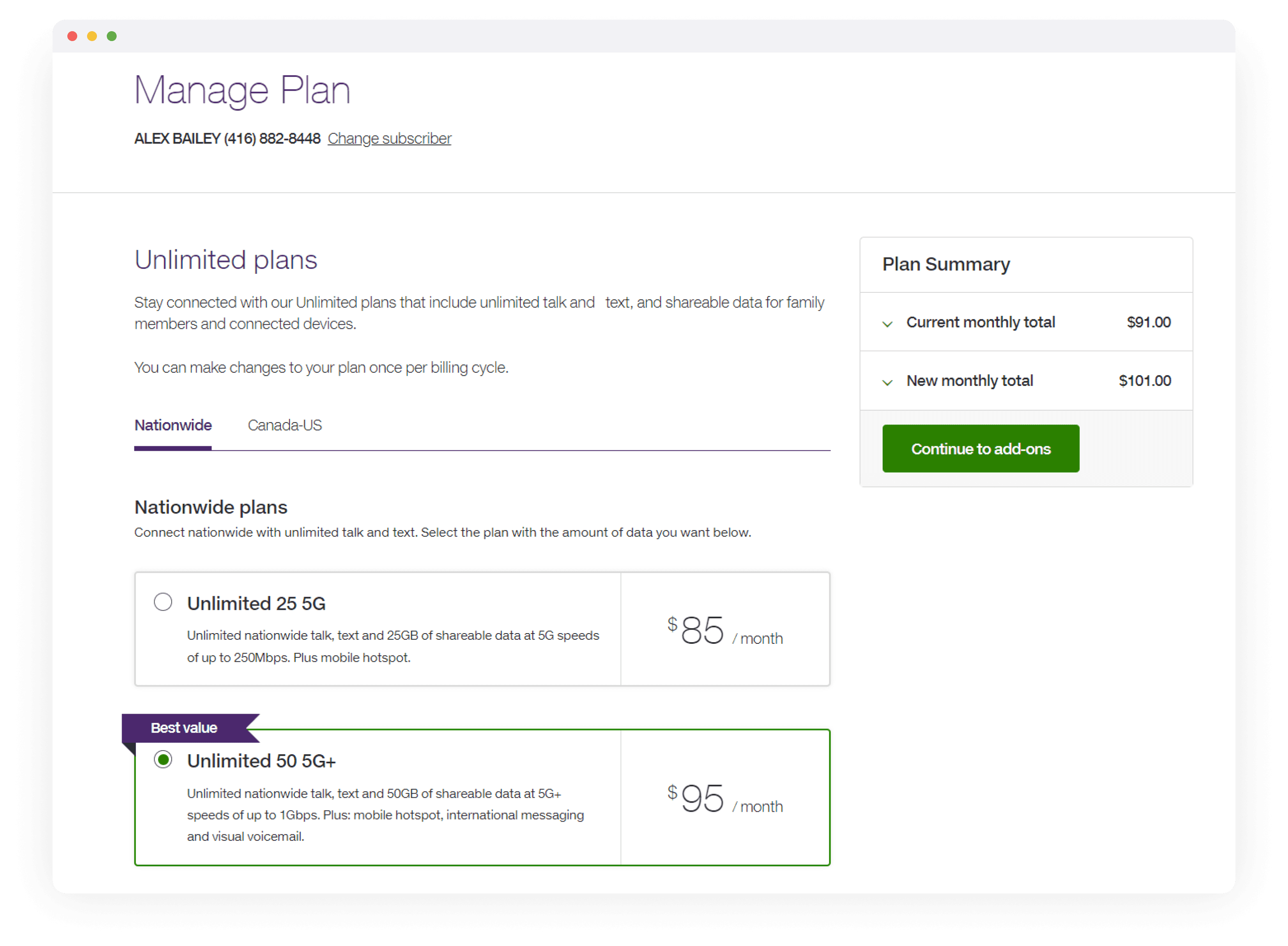
Re-order the flow to address number eligibility first
Previously, customers chose their old account input as the first step. By moving the phone number checker to the first step, we can surface their eligibility on step 1 and provide clear instructions on how to complete the flow.
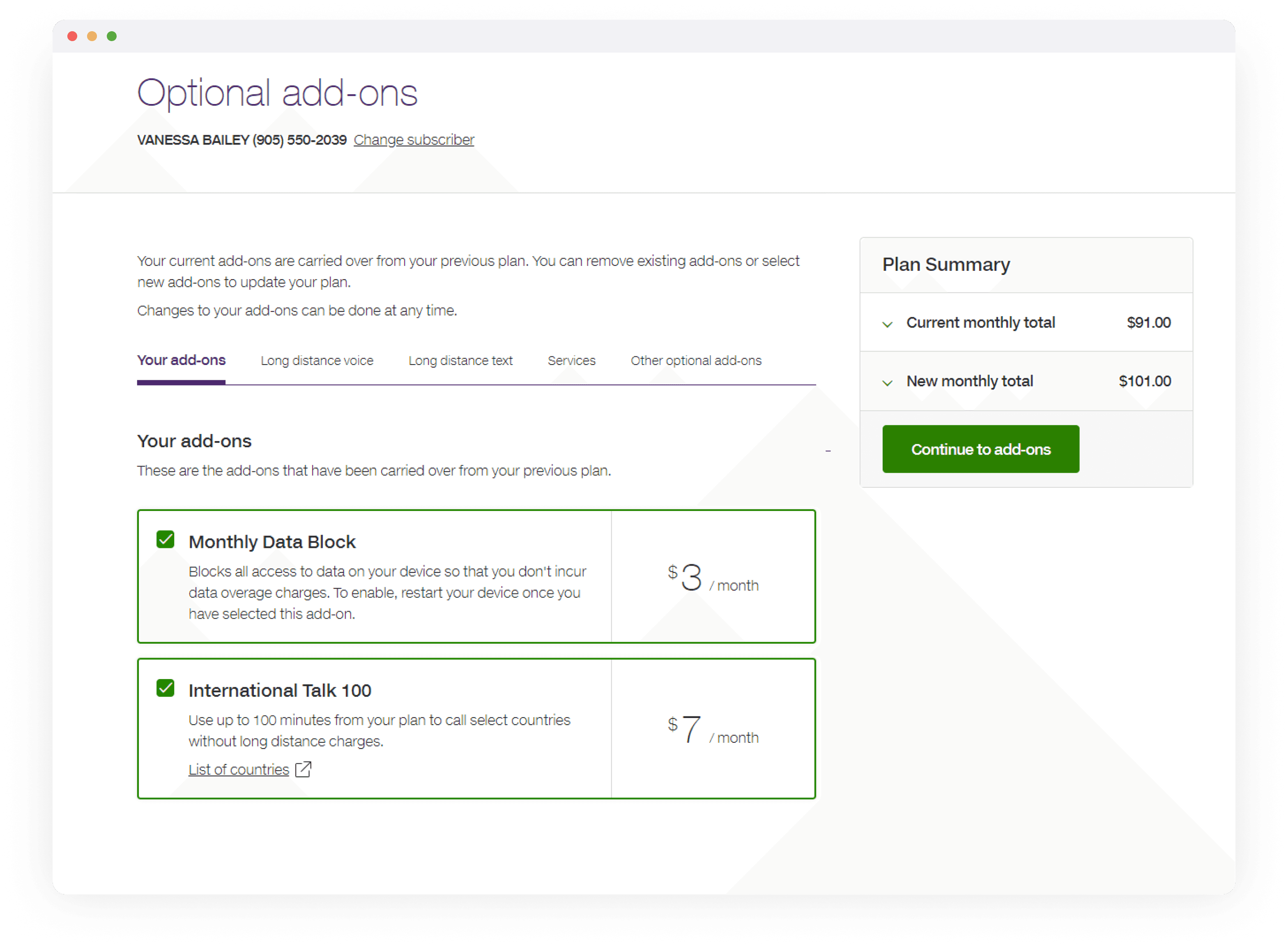
Simplify the necessary inputs
We revised the content to help customers find their old service details by referencing their old service bills from their previous provider. All the necessary inputs are grouped together on this screen, allowing customers to toggle between different old service details depending on what they have. By default, old account number is pre-selected because of the higher selection and success rate. On the review screen, customers can verify which number they are transferring, and which temporary number is being replaced.
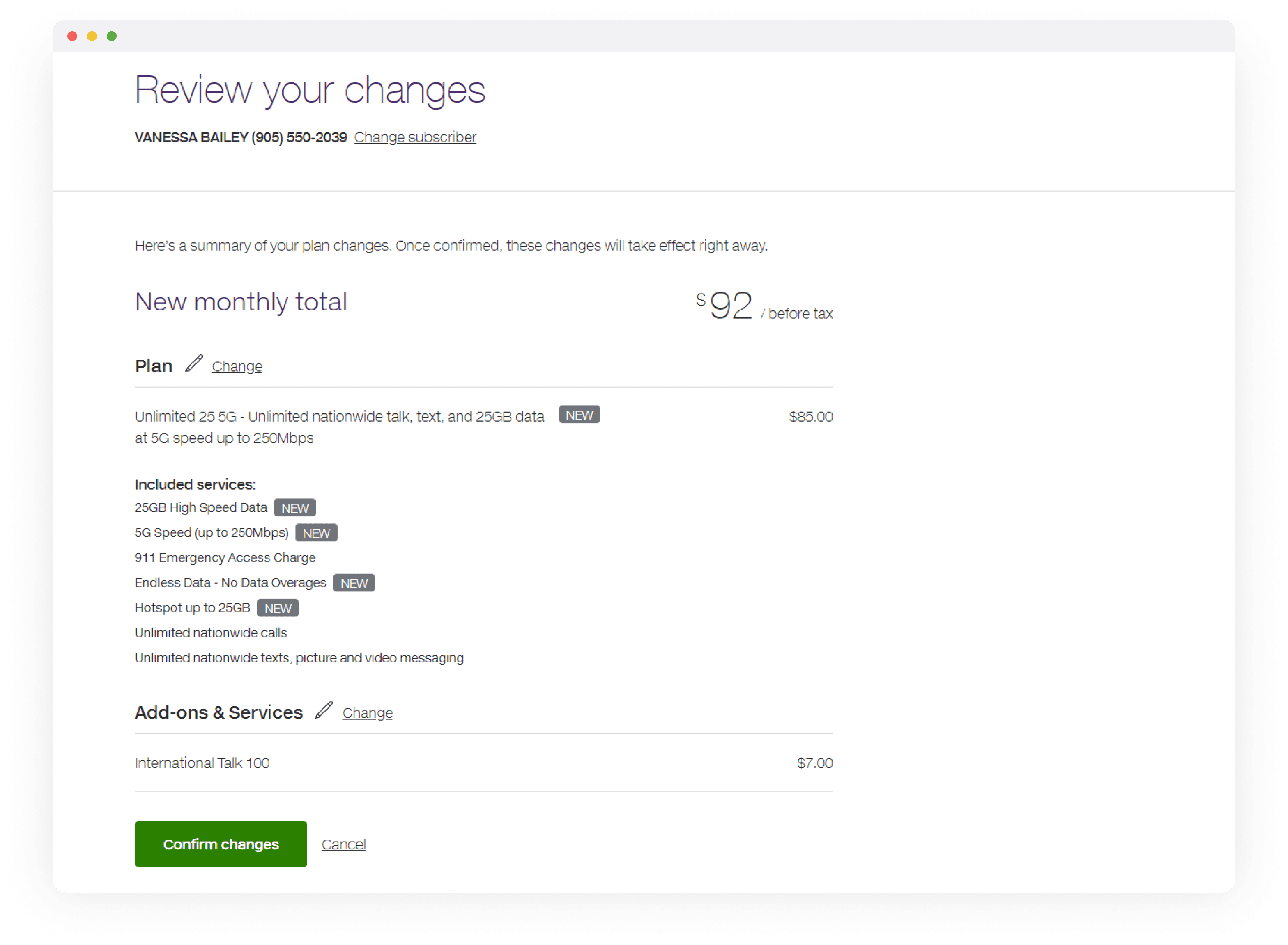
Highlight the importance of next steps
A new step was added where users must acknowledge the upcoming 2FA SMS before submitting their transfer. Previously, this instruction was given in the Confirmation screen, causing many users to miss the SMS and time out of the transfer period. By ensuring customers tick the checkbox to continue, we increased the rate of successful transfer.
Reflection and next steps
The project marked a significant upgrade in the customer experience, but also with aligning the flow with the new TELUS design system. It also modernized the underlying tech framework to ensure the content dynamically reflects current marketing initiatives. As we move forward, we’re focused on making backend-driven content more intuitive and customer-centric, starting from the Marketing teams creating the content entries. For a more detailed presentation on the design strategy and process for this project, please reach out.