Redesigning how customers shop and compare new mobile phone plans by increasing conversion and reducing drop-off rates.
Client
Role
Lead designer
Year
2023
Platform
Responsive web
Background
The rate plan change flow allows customers to modify their monthly phone plans and add-ons online—offering a convenient alternative to visiting retail stores. This self-serve option not only enhances user convenience but also reduces support call volume, which can cost the business up to $16 per call. I led the redesign of this flow using our new design system, with the goal of increasing conversion rates and reducing user drop-off. I collaborated closely with the Product Owner to make data-driven decision over feature prioritization and using prototypes and UX research metrics to gain buy-in from stakeholders.
Impact
Post-launch analytics showed that the redesigned experience improved both user engagement and business outcomes.
Conversion rate
15%
Year-over-year conversion
+30%
Drop-off rate decrease
-24.3%
User friction and research insights
I began by analyzing Voice of the Customer (VoC) feedback, which revealed that many users struggled to complete the 3-step flow—often abandoning it and calling customer support instead.
In collaboration with the UX Research team, we conducted 1:1 moderated usability testing on the existing experience to gain qualitative data on how customers felt during the journey. Key quotes from this study included:
Cross-functional alignment
I facilitated a cross-functional workshop to share insights and address pain points and opportunities in the customer journey. By evaluating our existing flow with competitor experiences, we identified opportunities and generated strategic ideas that informed our redesign direction.
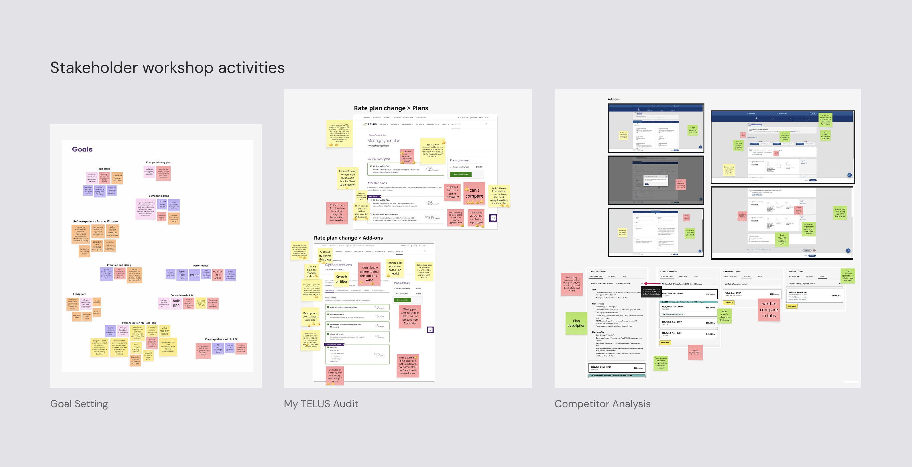
Redesign goals
By leveraging these user insights, we identified our main goals for the redesign with the intention of improving user confidence to self-serve.
1
Surface details for customers to assist with finding and comparing specific rate plans and add-ons
2
Improve add-on information architecture to match customer expectations for how add-on options should be grouped
3
Allow customers to be able to easily understand differences difference between potential option and current selection
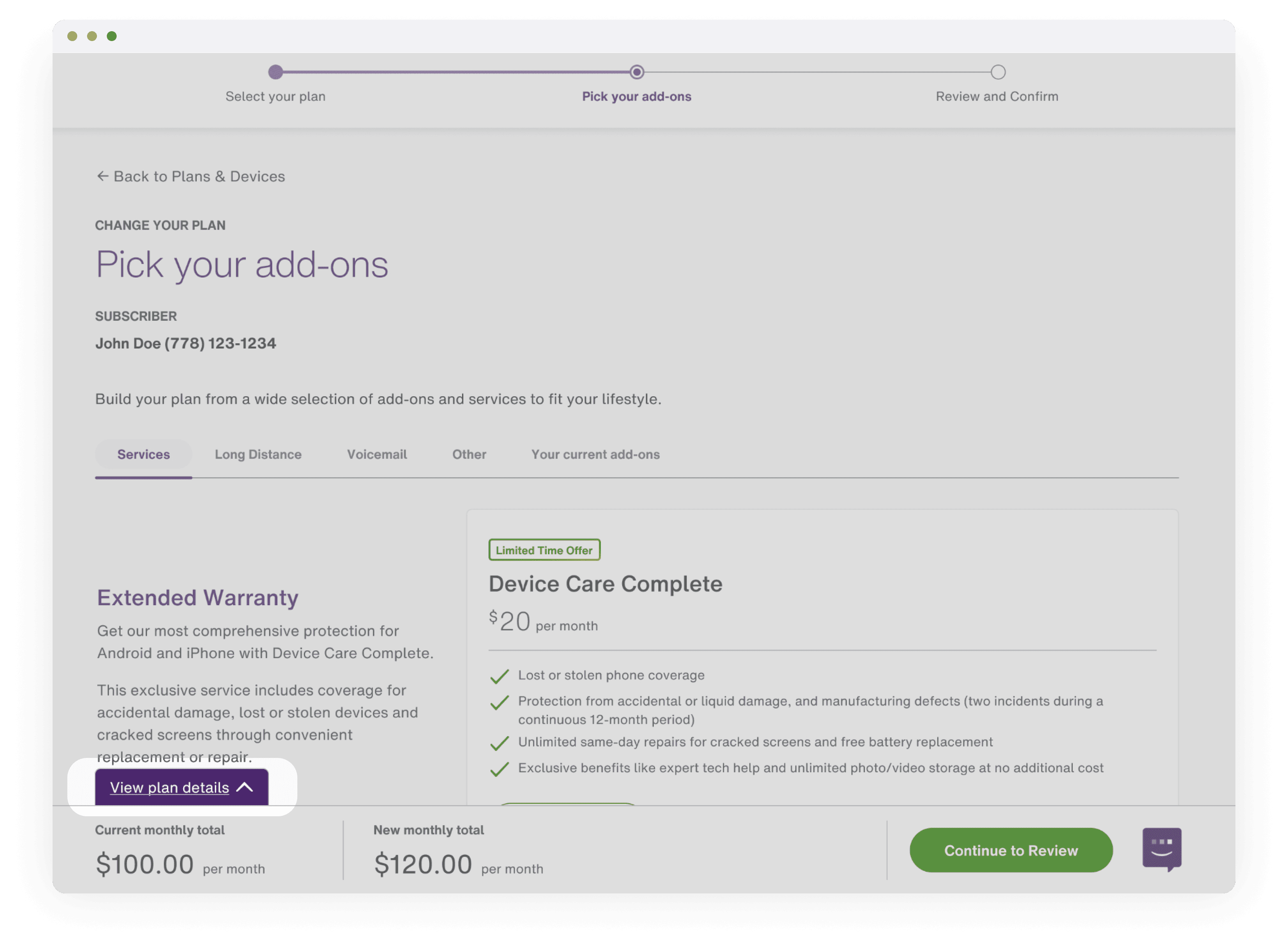
Design intervention
Guided by our goals, we worked on iterating through design improvements. I redesigned the layout of the experience, and collaborated with a content writer to better highlight key differences between plans and a customer’s current selection. We also revised the information architecture to better align with user expectations—grouping add-ons more intuitively and using clearer labels.


User testing validation
We ran an unmoderated usability test to evaluate whether users found the redesigned experience more intuitive for completing common tasks. Results showed strong improvements with the redesign, while highlighting two areas of improvement to increase the discoverability of add-on details and the comparison footer.
Design launch
Conveying value through the interface
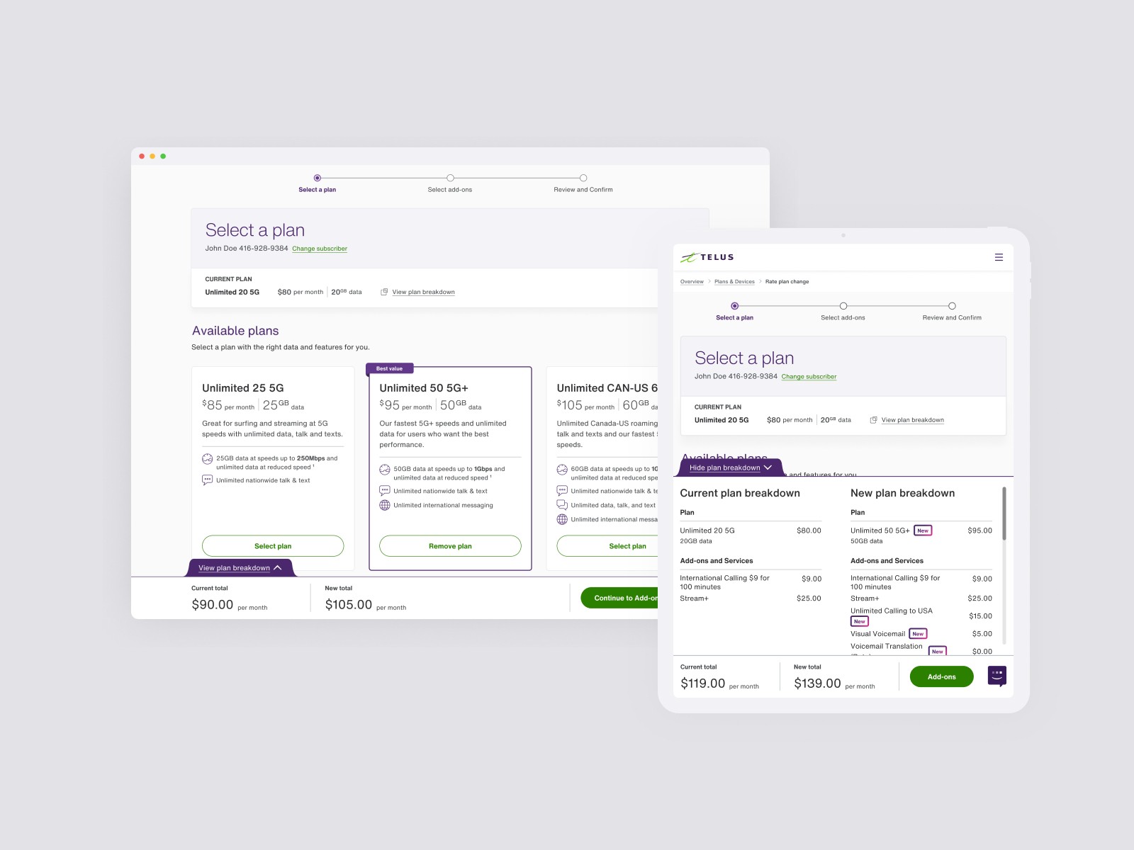
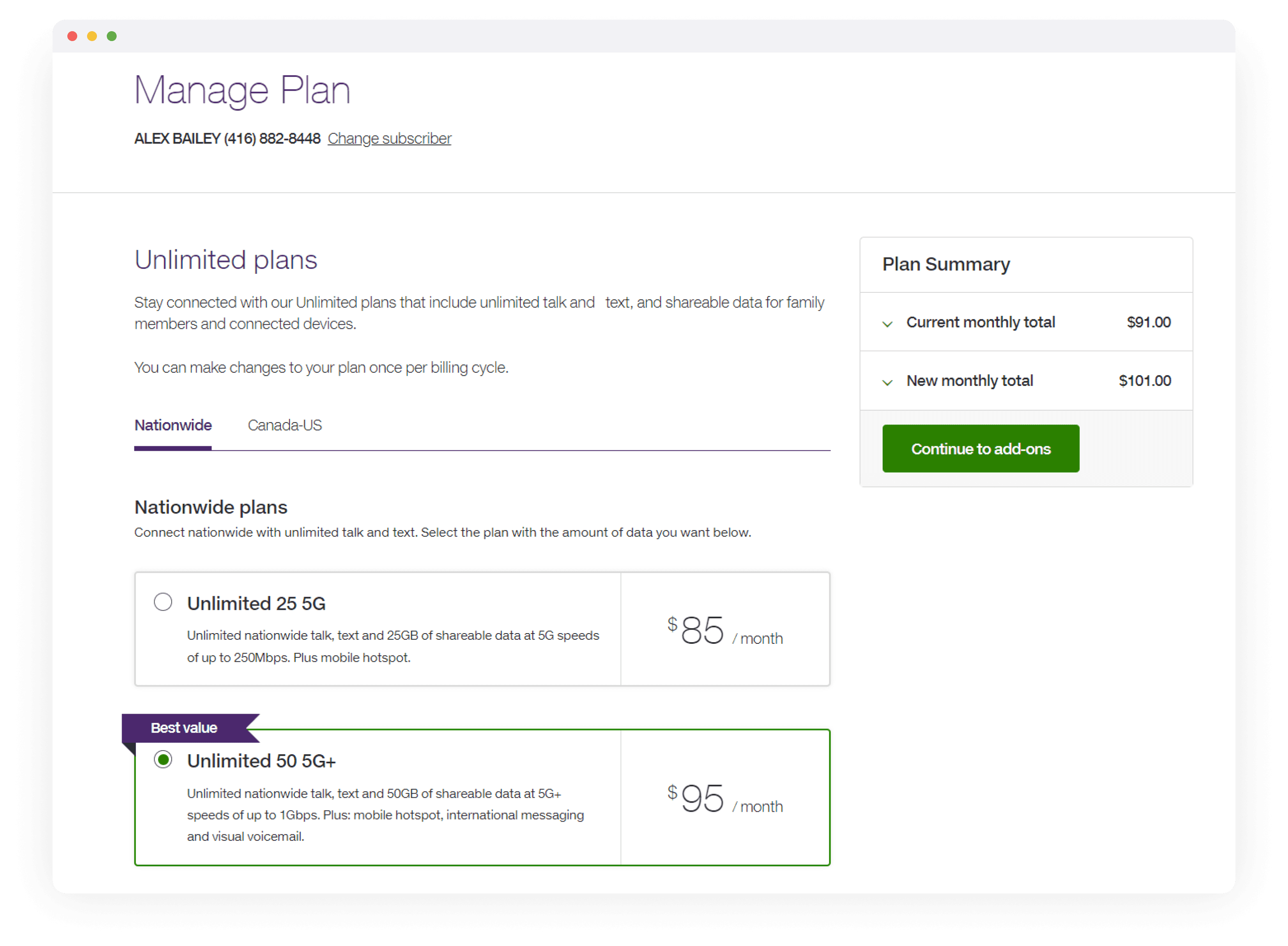
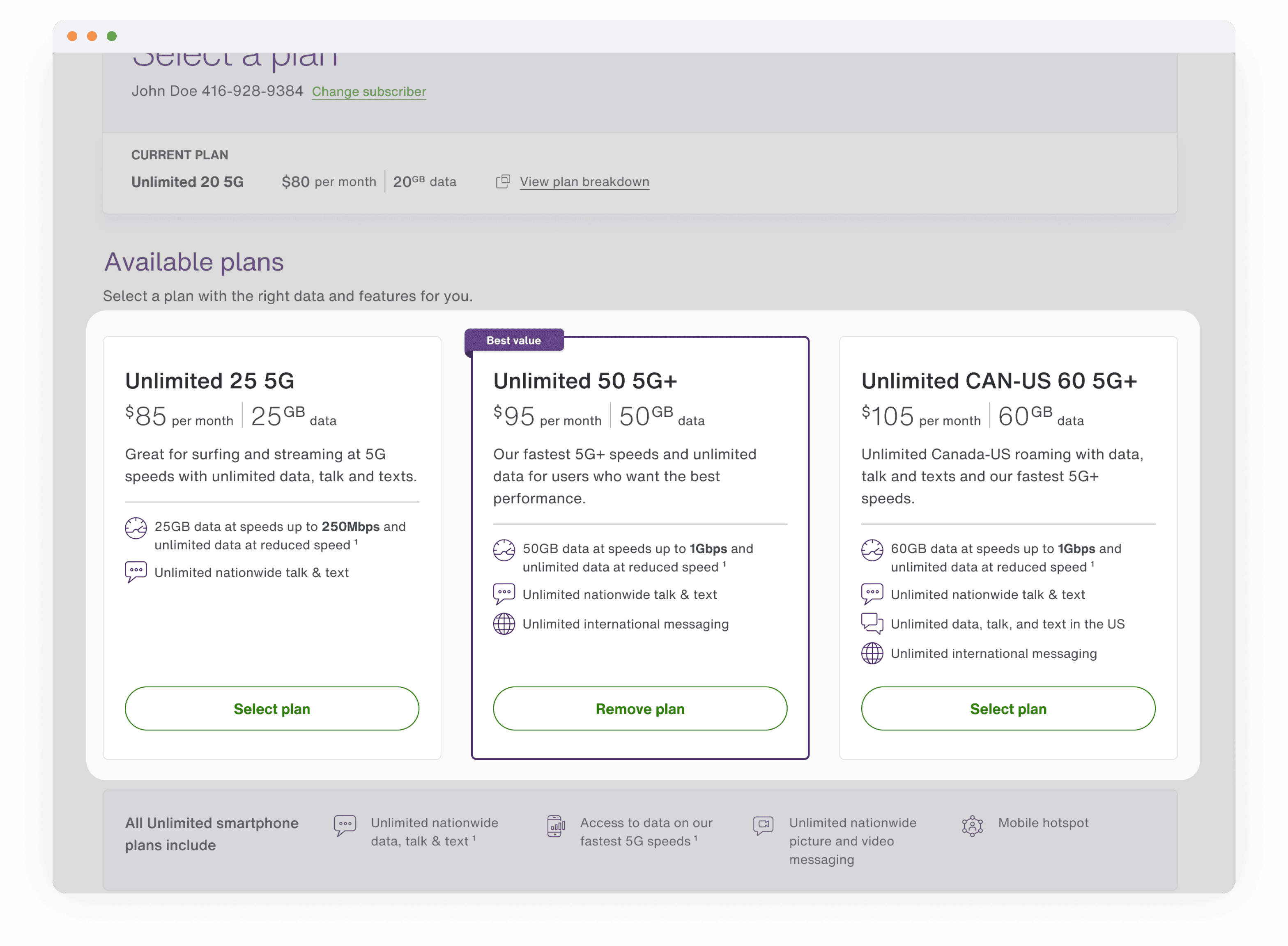
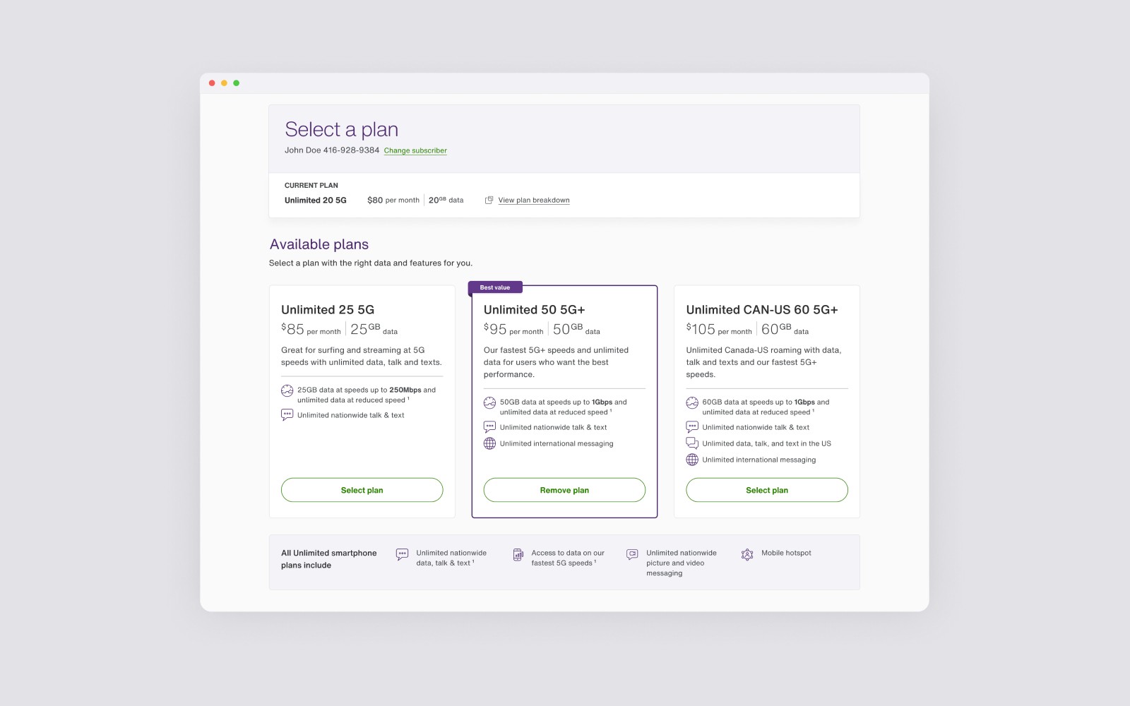
I redesigned the plan layout into vertically stacked cards to improve scannability and allow easier side-by-side comparison of features. In collaboration with engineering, we also enhanced the backend content retrieval system to ensure plan descriptions stayed consistent with current marketing language.
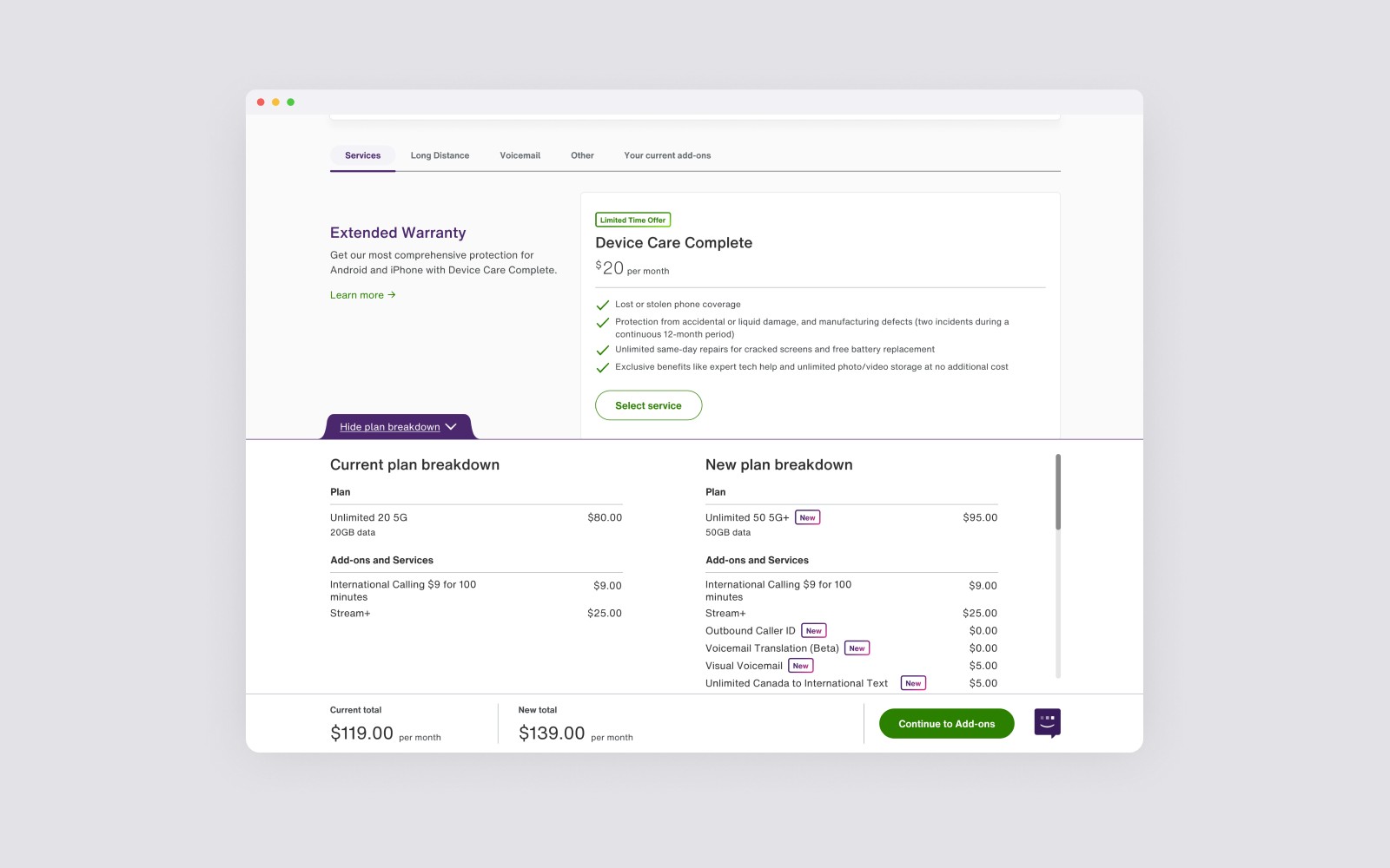
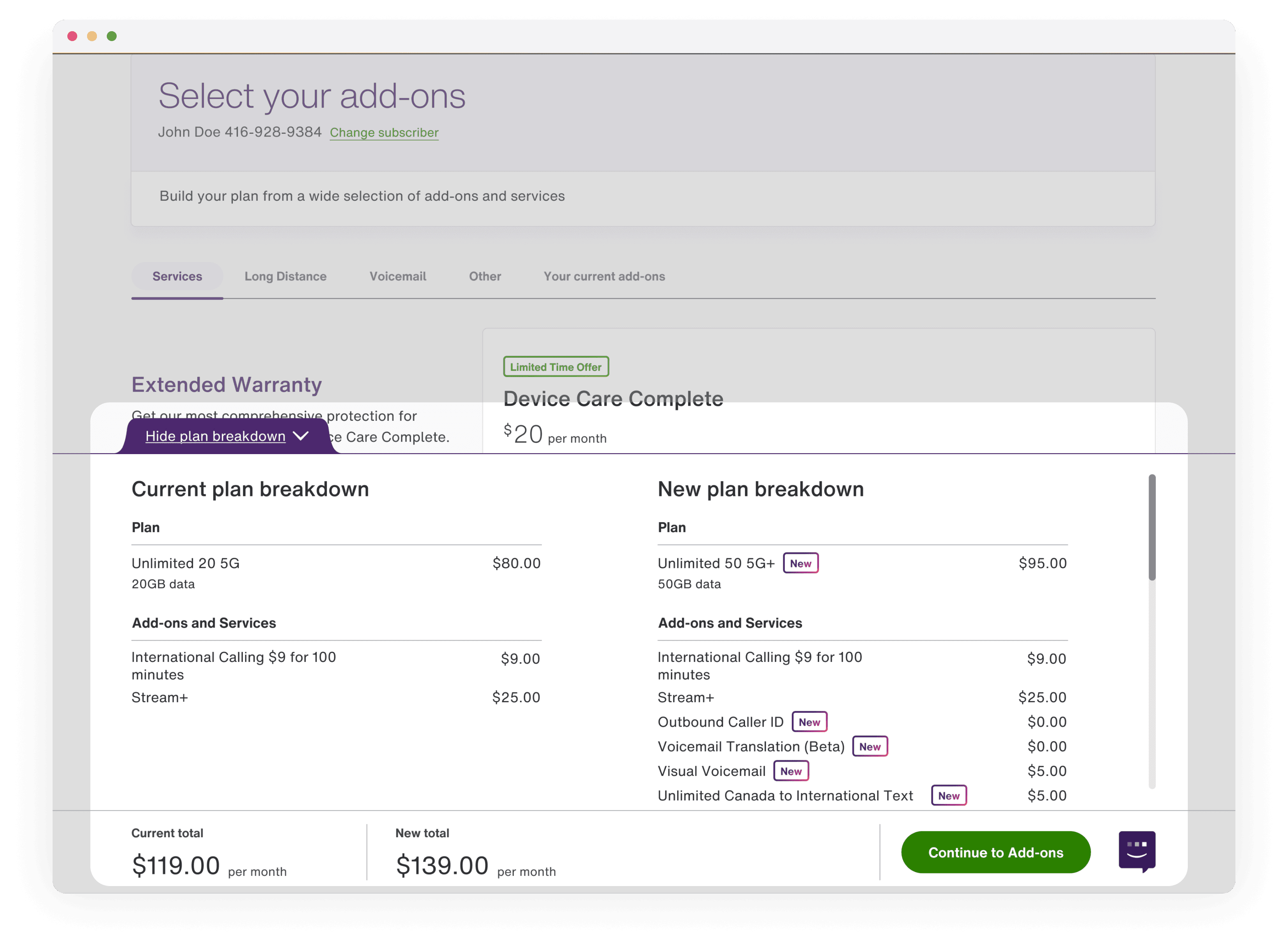
Clear comparison between current and new
To help users make informed decisions, I worked with engineering and the design system team to create and implement a comparison table within a new sticky footer. This allowed customers to easily reference their current plan and compare it against their selected plan—highlighting differences in price and features in real time.
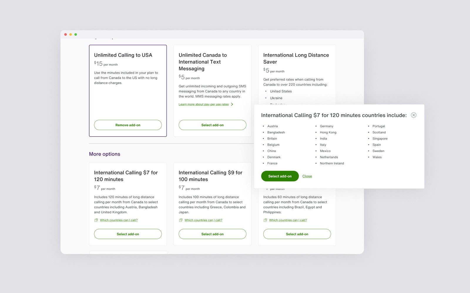
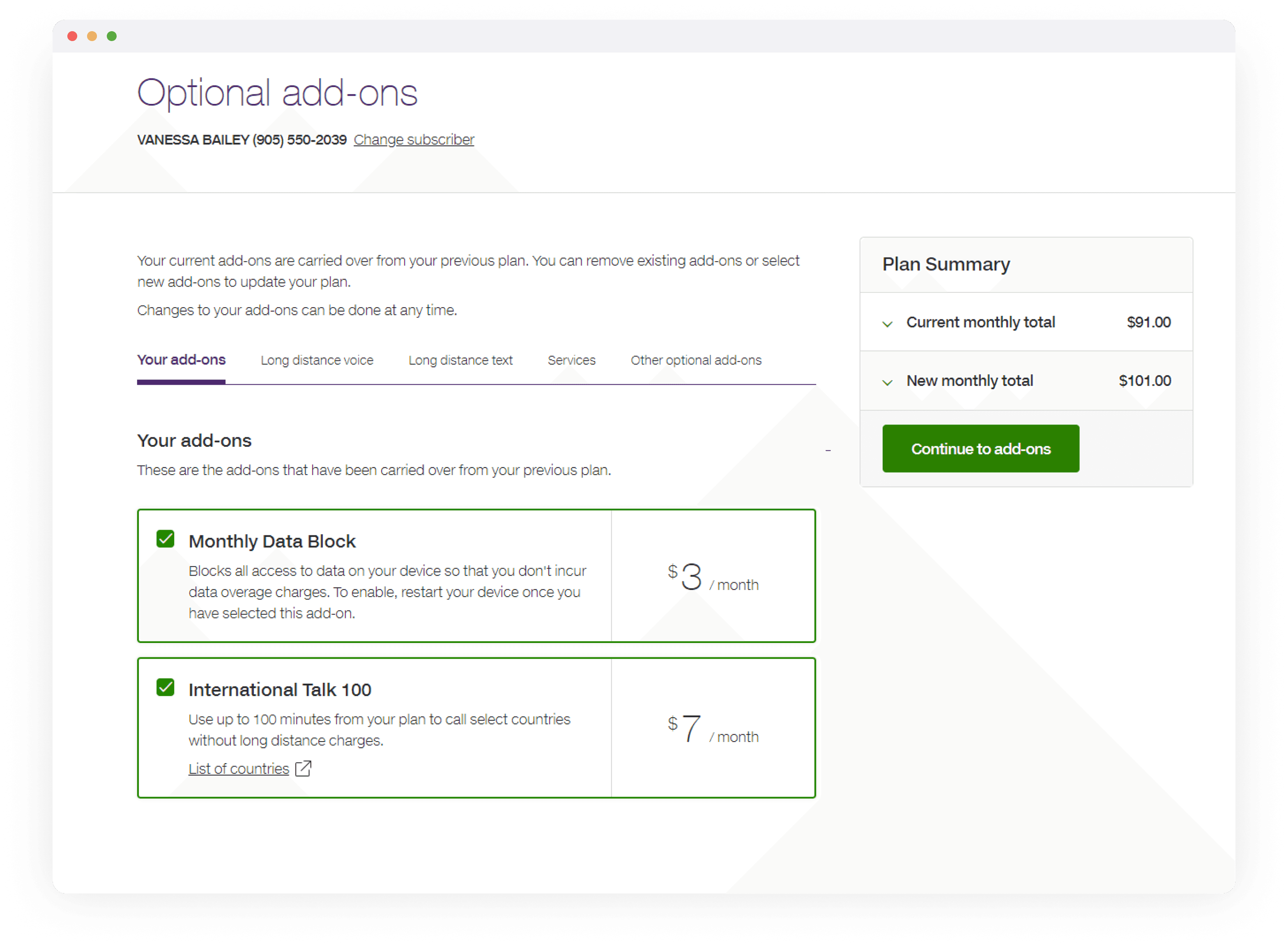
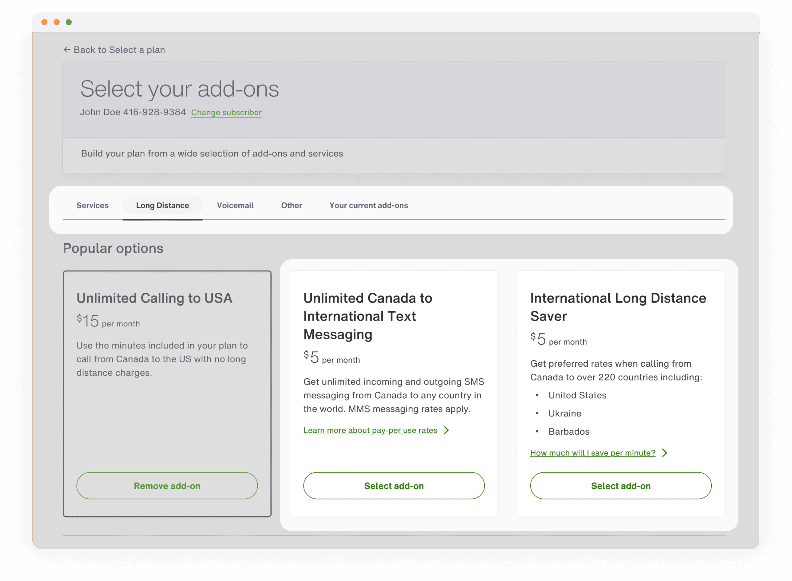
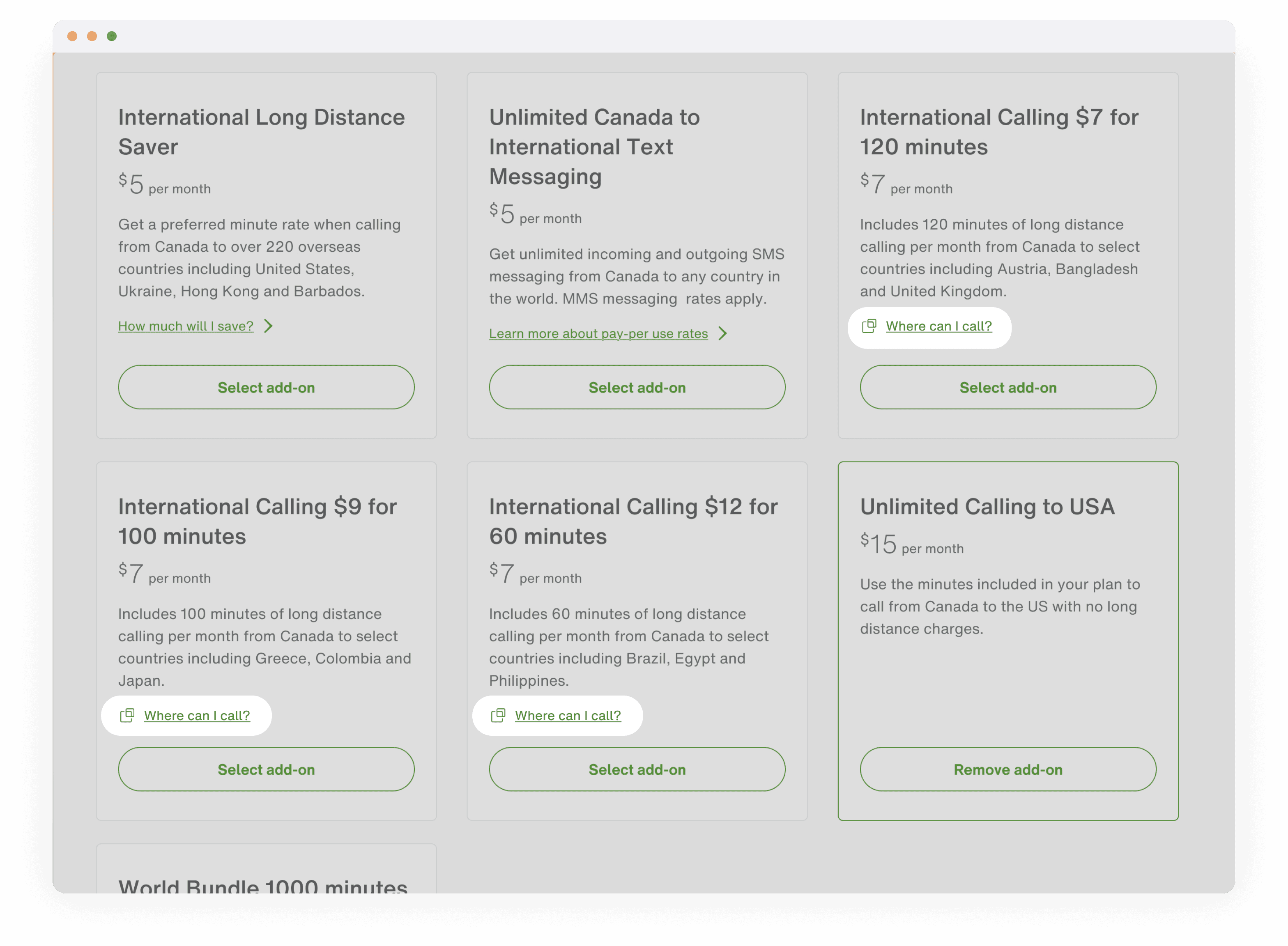
Improving the findability of add-ons
Using insights from a card-sorting exercise, we reorganized add-ons into more intuitive categories that reflected how customers naturally group services. I also introduced new interaction patterns, such as content modals, to surface key information and help users make confident purchase decisions and reducing drop-off.
Reviewing their new choices
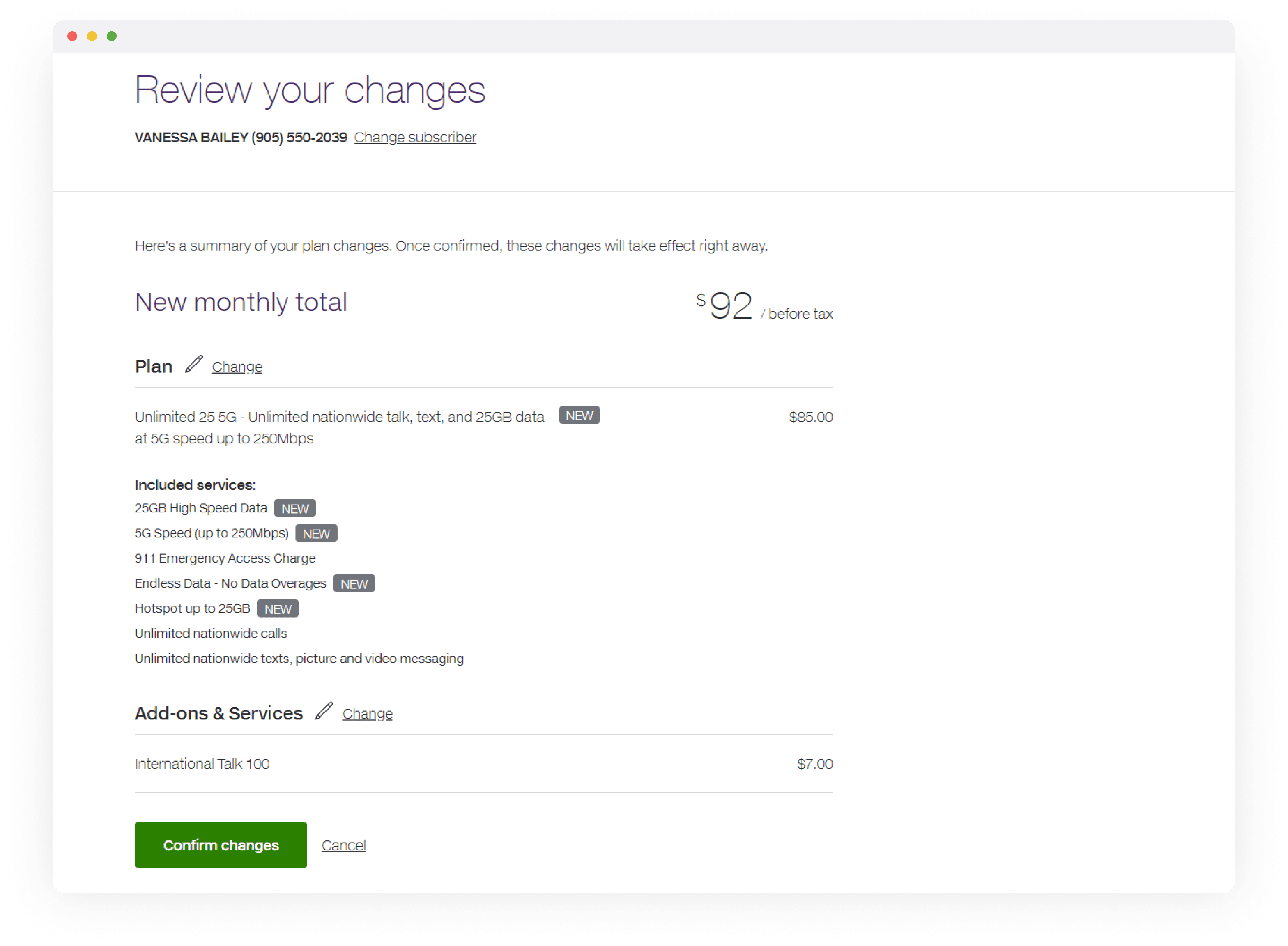
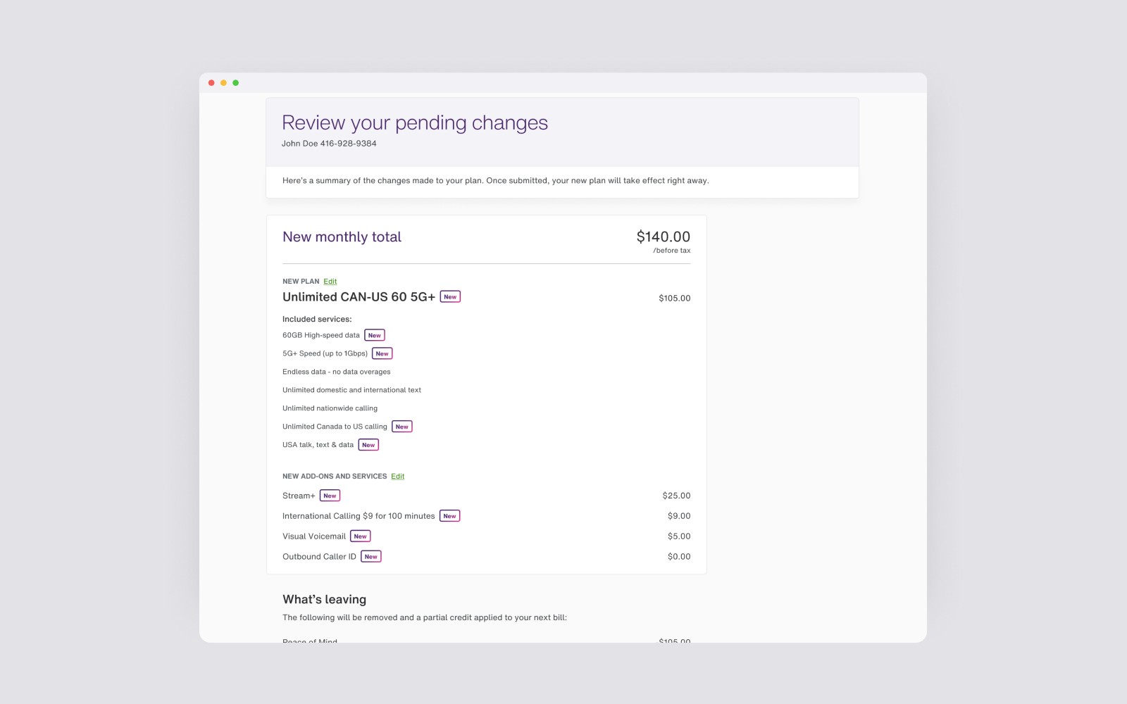
I redesigned the review page to reinforce user confidence before checkout. Visual indicators—such as “New” badges and a dedicated section for removed features—clearly summarize changes to the customer’s plan.
Reflection and next steps
The project marked a significant upgrade in the customer experience, but also with aligning the flow with the new TELUS design system. It also modernized the underlying tech framework to ensure the content dynamically reflects current marketing initiatives. As we move forward, we’re focused on making backend-driven content more intuitive and customer-centric, starting from the Marketing teams creating the content entries. For a more detailed presentation on the design strategy and process for this project, please reach out.