Overview
Phone Plan Change
A complete redesign of the self-service experience enabling TELUS customers to browse, customize and purchase their mobility phone plans.

Year
2023
Project type
Responsive web
Client
TELUS
Introduction
Shopping and browsing for a new phone plan
The rate plan change flow allows customers to modify their monthly phone plans and add-ons online—offering a convenient alternative to visiting retail stores. This self-serve option not only enhances user convenience but also reduces support call volume, which can cost the business up to $16 per call.
I led the redesign of this flow using our new design system, with the goal of increasing conversion rates and reducing user drop-off. I collaborated closely with the Product Owner to make decisions around feature prioritization and using prototypes and UX research metrics to gain buy-in from stakeholders.
Impact
Higher shopping completions through self-serve
Analytics from the launch showed that the redesigned experience had improved both user engagement and business outcomes
+15% increase in conversion rate
-24.5% decrease in drop-off rates
+30% increase in Year-over-Year conversion rates
Problems
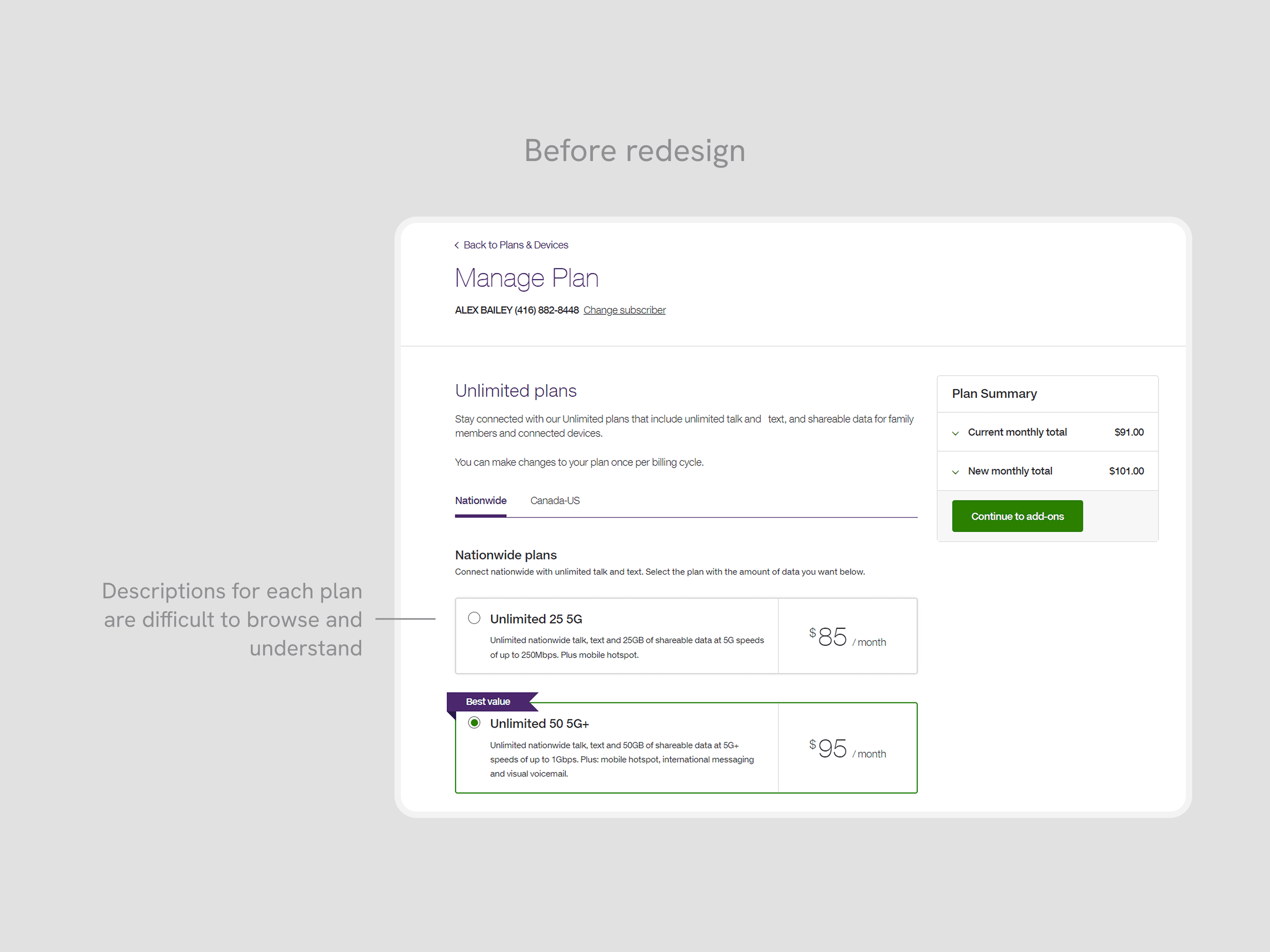
Challenging with shopping confidently online
Using Voice of the Customer (VoC) feedback, as well as conducting a conducting a 1:1 moderated usability study, highlighted that users struggled through the three-step journey.
Plans were not convincing enough
Users felt that the text block of plan descriptions were difficult to understand what they included, or how they differed between other plan options
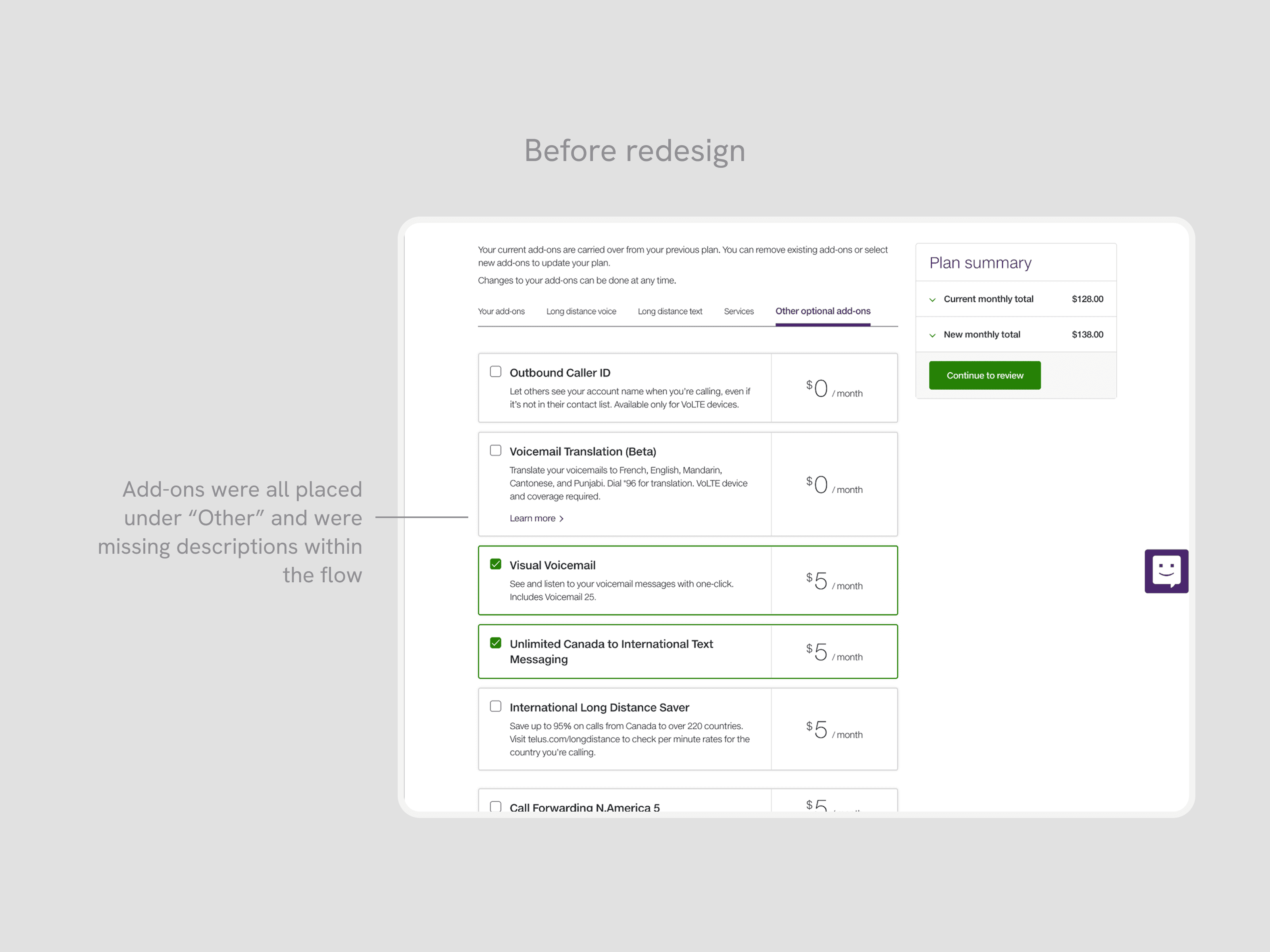
Add-ons were disorganized and missing information
Most add-ons were categorized incorrectly into the "Other" category, making it difficult to filter through the right features that a customer needed. For the most popular add-ons, which were Long Distance features, the list of included countries were not easy to find, taking them out of the experience into a new tab to manually search.
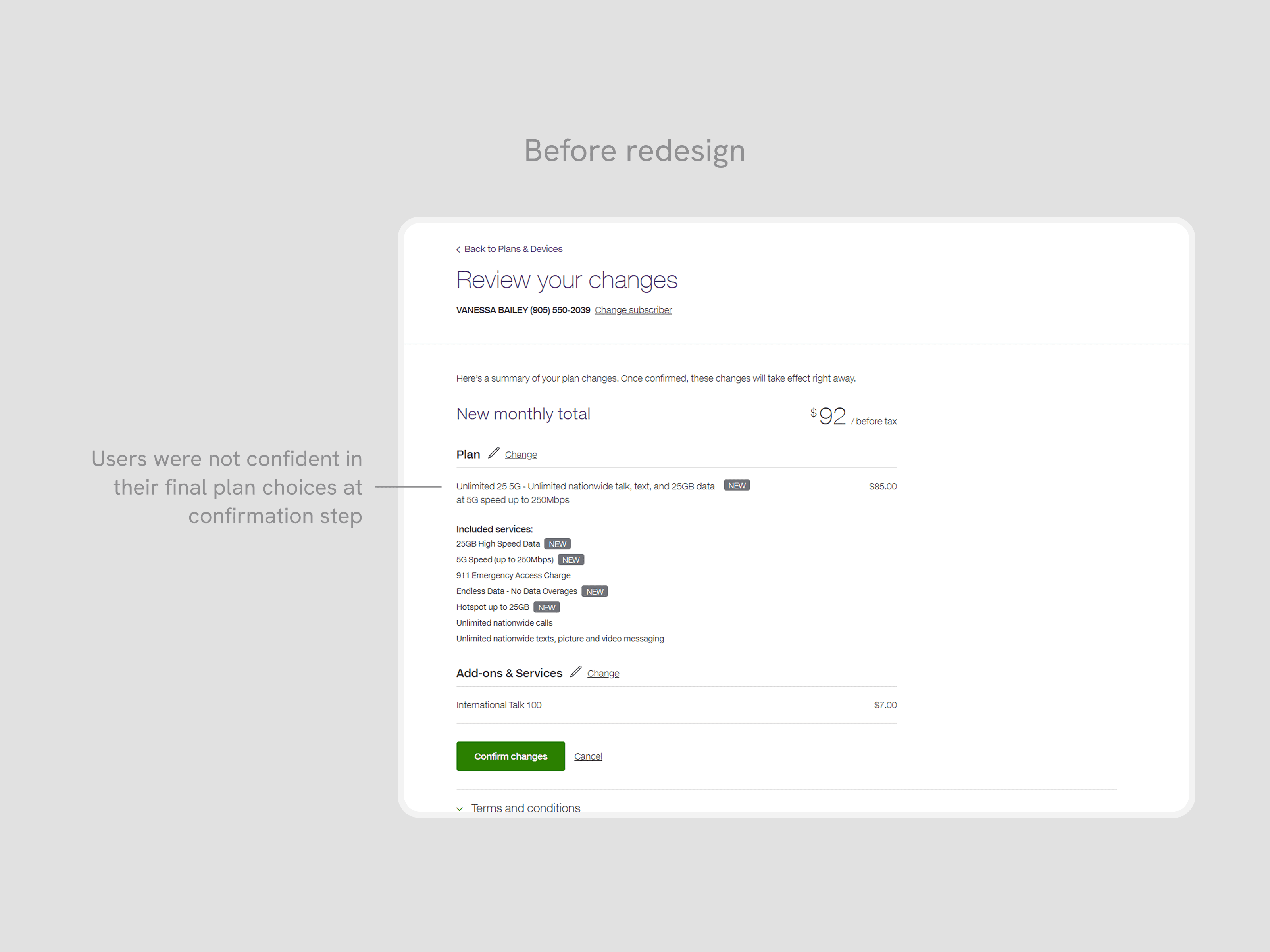
Confirmation relied on recall over recognition for changes
On the last step, customers were unconfident about the changes they selected, and how it differs from their existing plan. This hesitation resulted in a high chance of drop-off, right before submitting their changes.
Collaboration
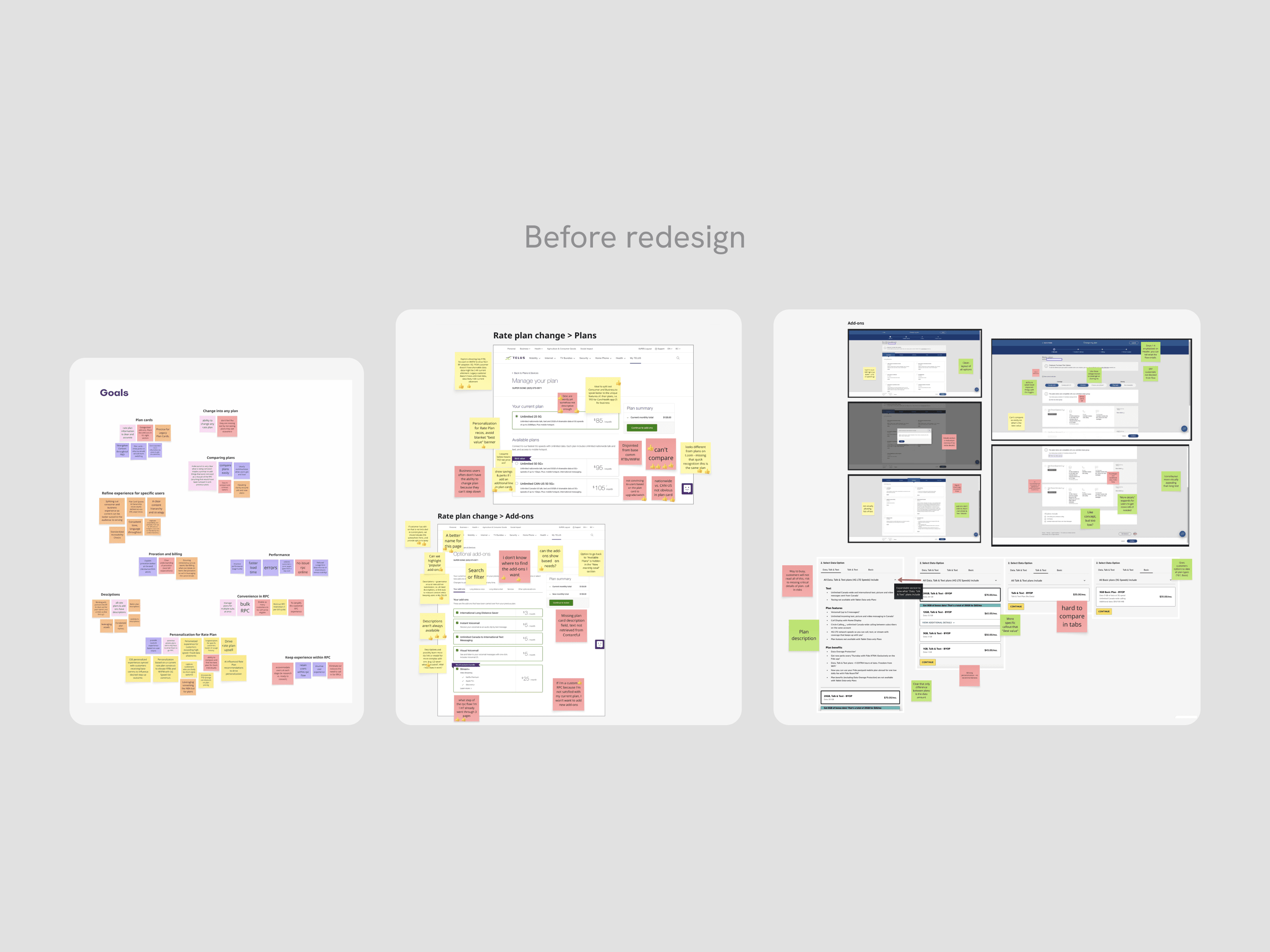
Aligning with stakeholders
To align with the team, I facilitated a cross-functional workshop to share insights and address pain points and opportunities in the customer journey. By evaluating our existing flow with competitor experiences, we identified opportunities and generated strategic ideas that informed our redesign direction.
Opportunity
Improving user confidence to shop and purchase plans
By leveraging these user insights, we identified three equally important goals: surfacing plan details clearly so customers could understand what each plan included, restructuring add-on categories so the right features were findable, and providing a real-time comparison between their existing and newly selected plan so customers could confirm their changes with confidence.
Final designs
A redesign to prioritize a seamless shopping experience
By reimagining the layout and utilizing new components and design language, the interface better showcased our product offerings and provide confidence in users to browse, select, and checkout.
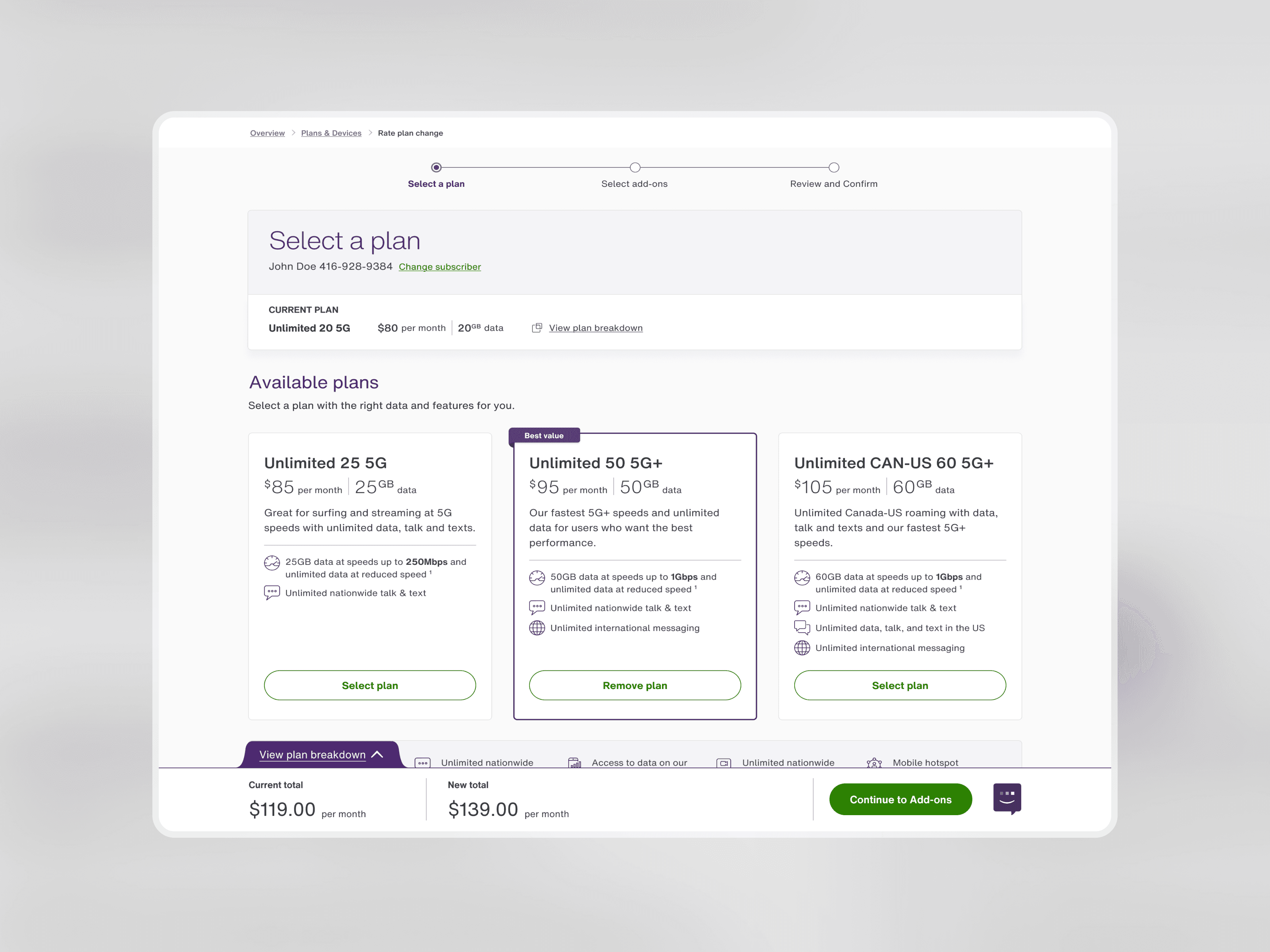
Improved scannability for plan cards
The new plan cards are vertically stacked, and structured with a clear hierarchy to provide a side-by-side comparison of price and features. With plan and data amounts being the most important to users, the details are provided at the top of the card in larger typography. The breakdown of features are listed with icons, making it easy to compare which type and how many features are available at each price point.
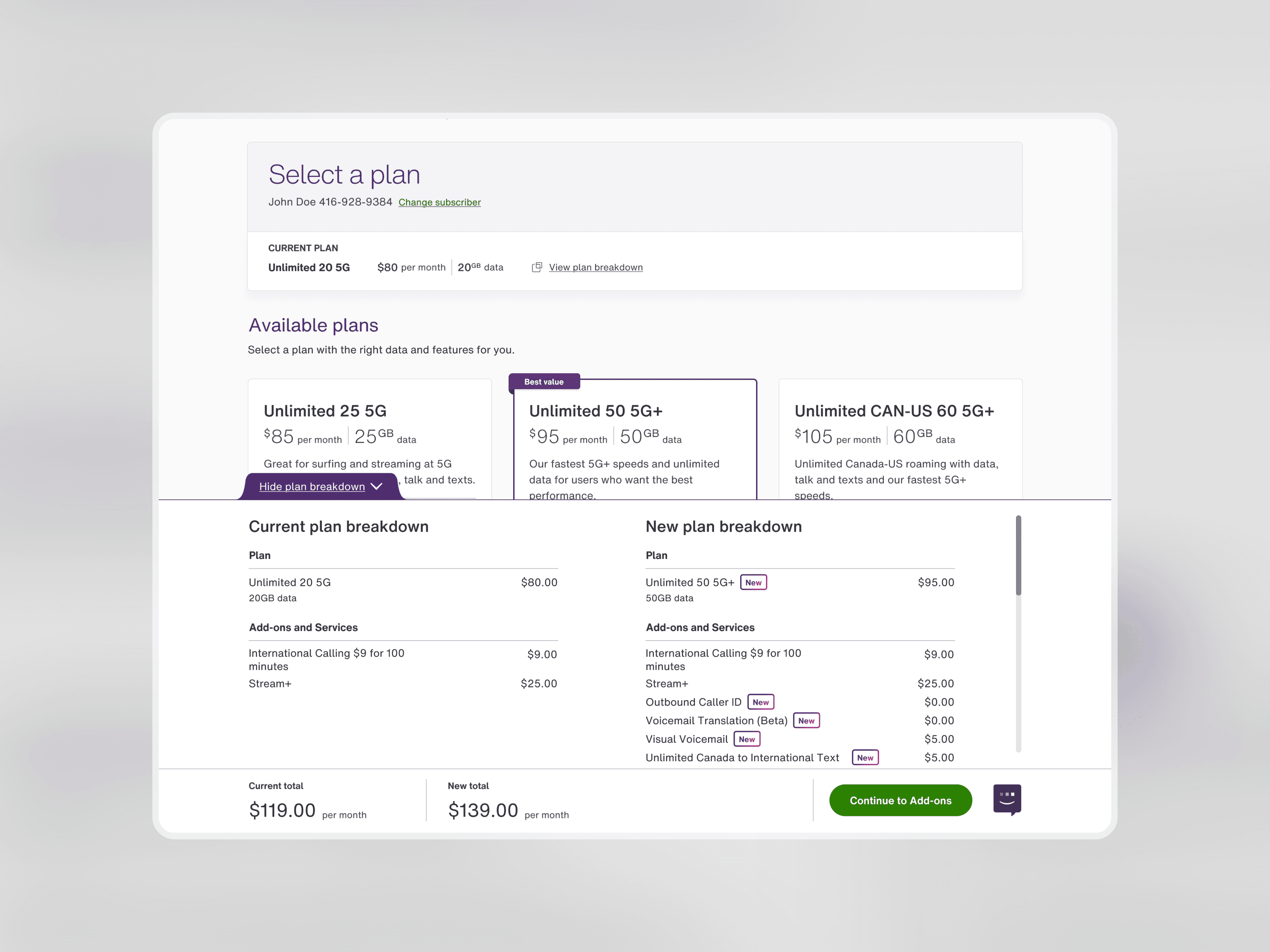
Comparison between existing and new plan
In close collaboration with the Design System and Engineering, I created and implemented a comparison table. This allows customers to reference their existing plan and compare it against their newly selected plan—highlighting differences in price and features in real time.
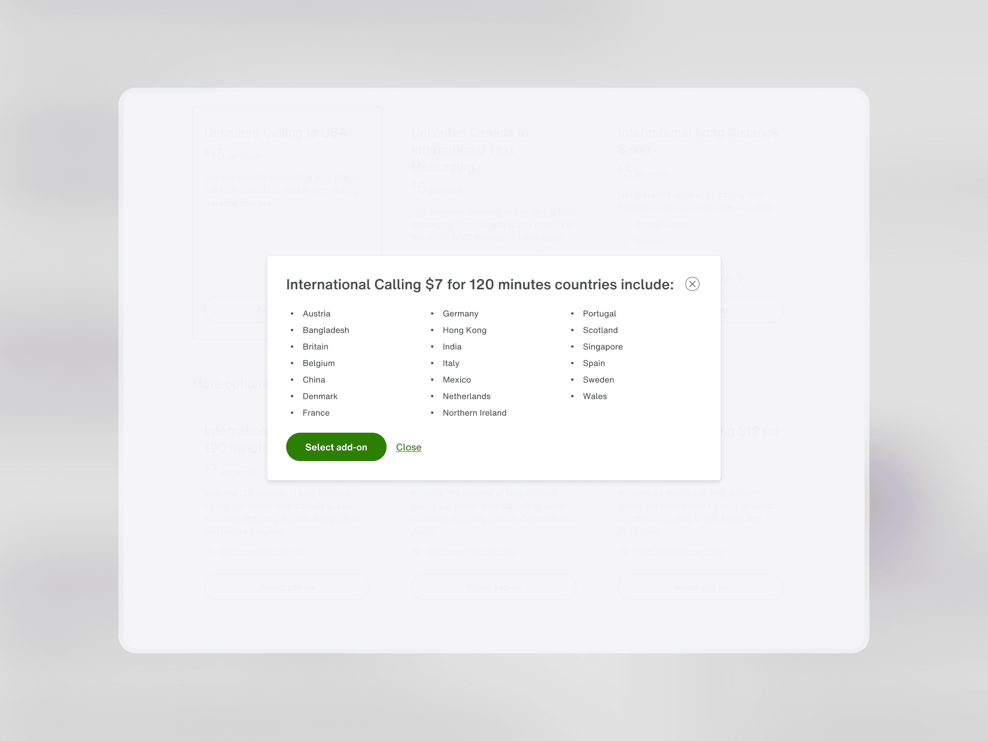
Improving the discoverability of add-ons
Leveraging research from a card-sorting exercise, we re-organized add-ons into intuitive product categories that customers expect to see. Using the new design system, I introduced content modals into the flow, so that key information that a customer needs to see before purchasing is available, rather than a redirect or a new tab.
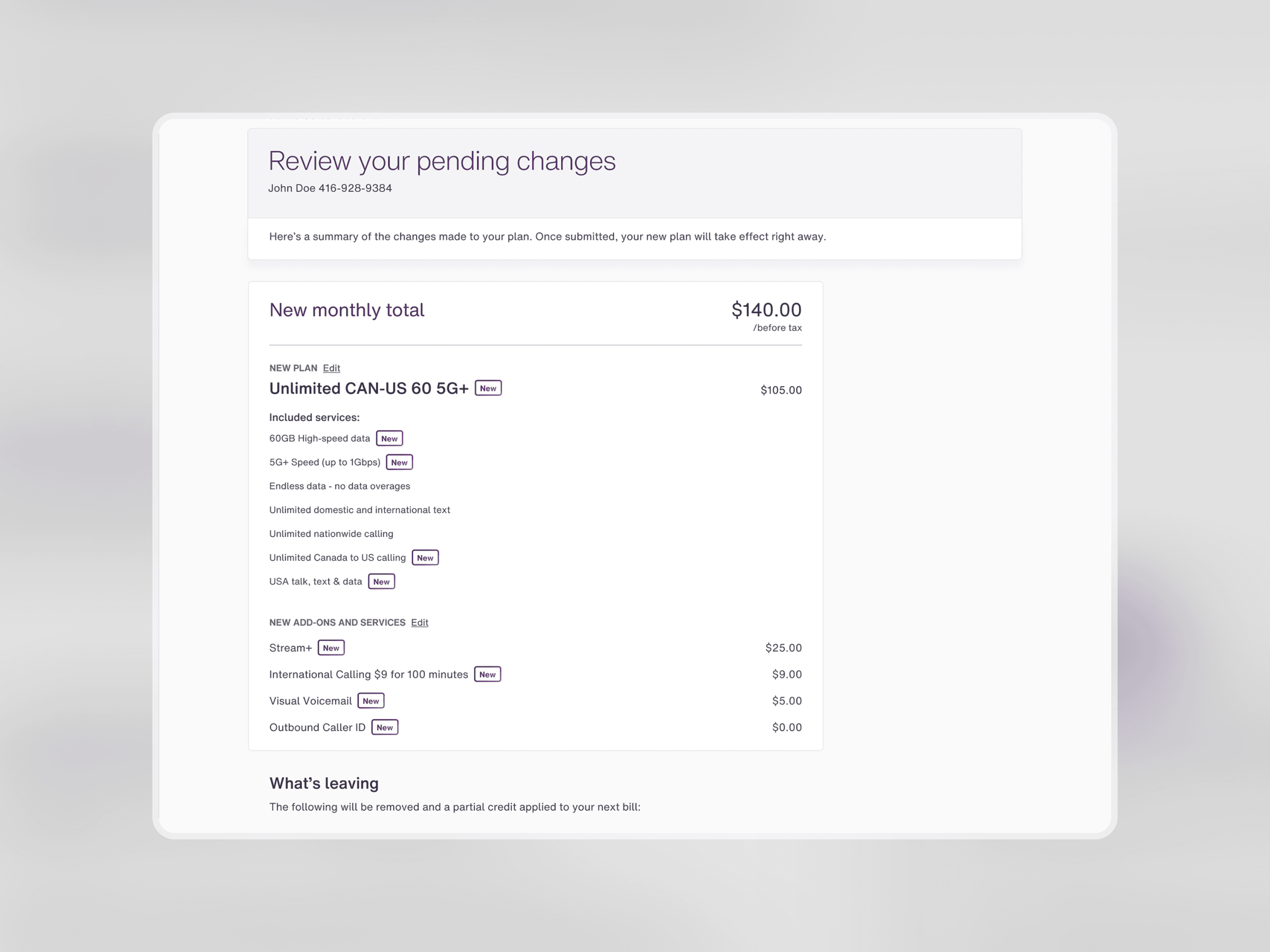
Reviewing new choices with confidence
The confirmation page leverages an updated version of the New badge to highlight any new products with a bright purple gradient. We added a new dedicated section to show which features have been removed from their new plan, allowing them to clearly see what is new and what is leaving, once they select Confirm.
Takeaway
Key takeaways
The most complex challenge was the comparison table component. Although built from existing design system parts, it introduced a new drawer-like pattern to the web experience. This required detailed documentation of its compact and expanded states, and how content adapted to user selection. However, advocating for its creation and seeing it through to implementation as my first custom pattern was one of the most rewarding parts of the project.
Pulling product data from multiple APIs added another layer of complexity. Aligning stakeholders early was essential to both format data clearly and to surface missing plan and add-on descriptions that needed to be created before launch.
Looking back, I would have loved to explore personalization in a future iteration. By leveraging customer data and usage patterns, the application could recommend plans and add-ons uniquely tailored to each user, reducing browsing effort.