Overview
Phone Number Transfer
Phone number transfer allows new TELUS customers to transfer their existing phone numbers into the network. I created the designs for the mobile app flow, allowing customers to initiate and validate their number transfer entirely within the app

Year
2024
Project type
Mobile app
Client
TELUS
Introduction
First action as a new customer
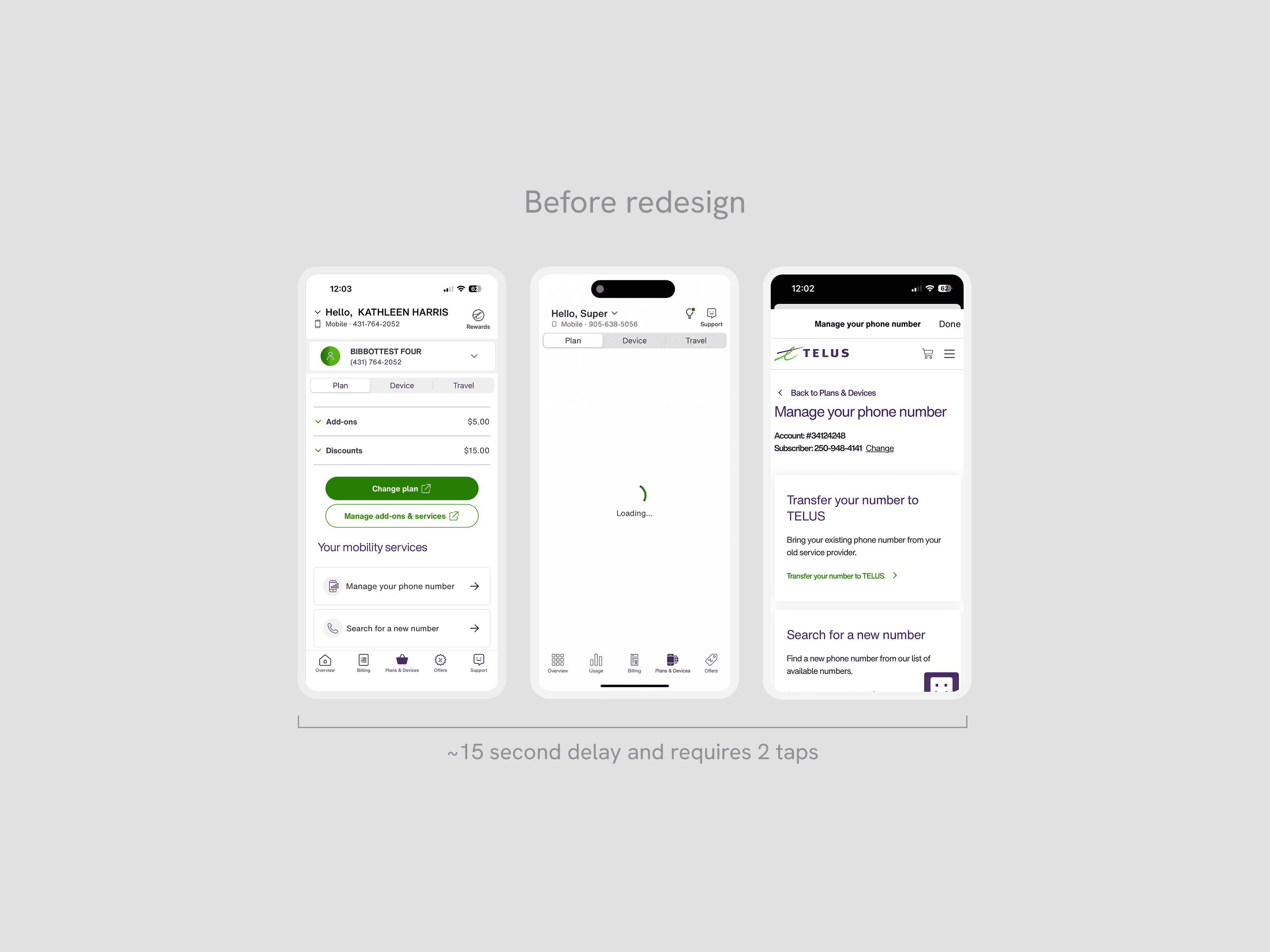
For new TELUS customers, porting in their existing phone number to the carrier is the most visited self-serve flow during onboarding. Currently, the app entry point redirects to the mobile web experience, which had poor usability for mobile phones.
As the Lead Designer, I audited the existing mobile web experience to identify drop-off points and inform the new app flow, then led the end-to-end UX and flow structure in collaboration with a Content Writer and Product Owner. Working closely with developers, I provided detailed documentation to accommodate React Native constraints, helping to ship the first React Native app experience built in-house at TELUS.
Impact
Increase in customers successfully moving to TELUS
Through these optimizations in simplifying the end-to-end flow, the conversion rate significantly increased compared to the past year:
+465% increase in port-in conversion rates (Previous 4.3% to new 24.3%)
+490% growth in total completions in a one-week period (1027, compared to last year's 174)
6x faster in processing successful port-ins
Problems
Poor performance and clarity
The existing mobile web flow suffered from slow performance, unclear information needs and instructions (eg. providing old account number or old IMEI number), and confusing next steps to confirm the transfer. The existing experience's drop-off rate was ~23%.
Poor performance when cross-linked to mobile web
Users had to wait over 15 seconds to land on the web experience, causing drop-off rates over long wait times.
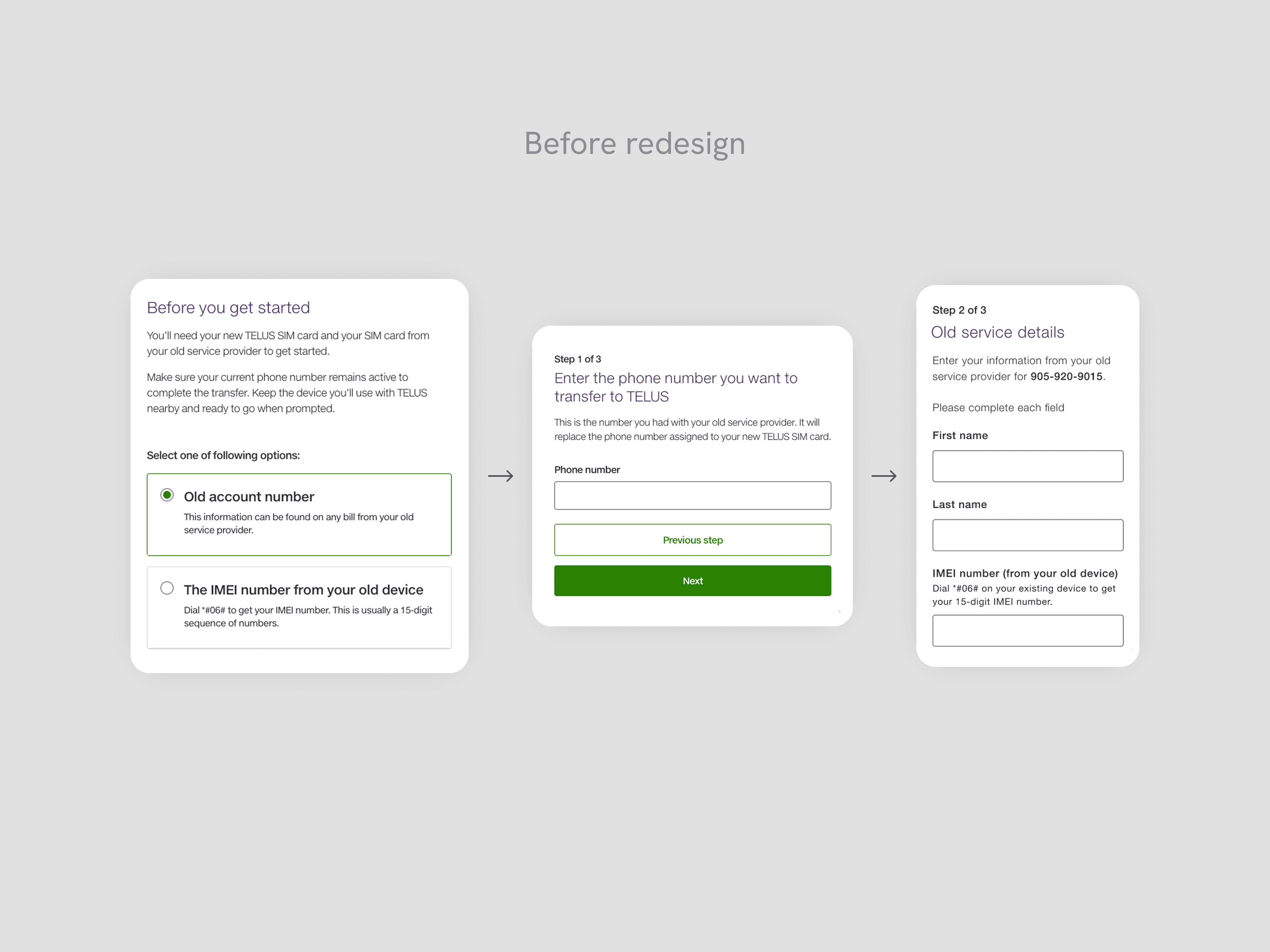
Confusion on how to find required information
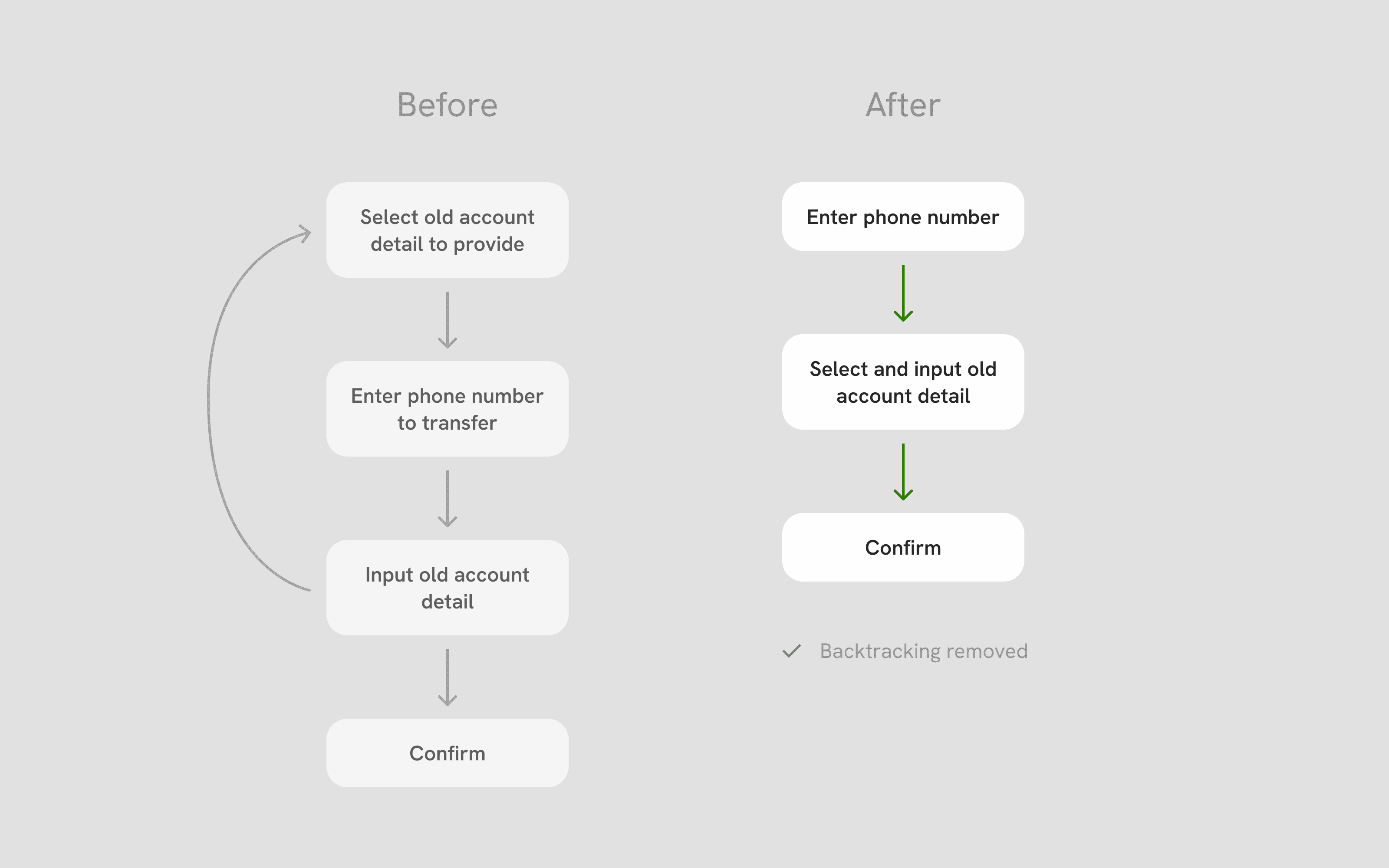
The multi-step flow was fragmented, making it difficult for users to anticipate what kind of information they needed to input. If they made a mistake by the time they were filling the required information in Step 3, they would have to backtrack the entire flow to fix it.
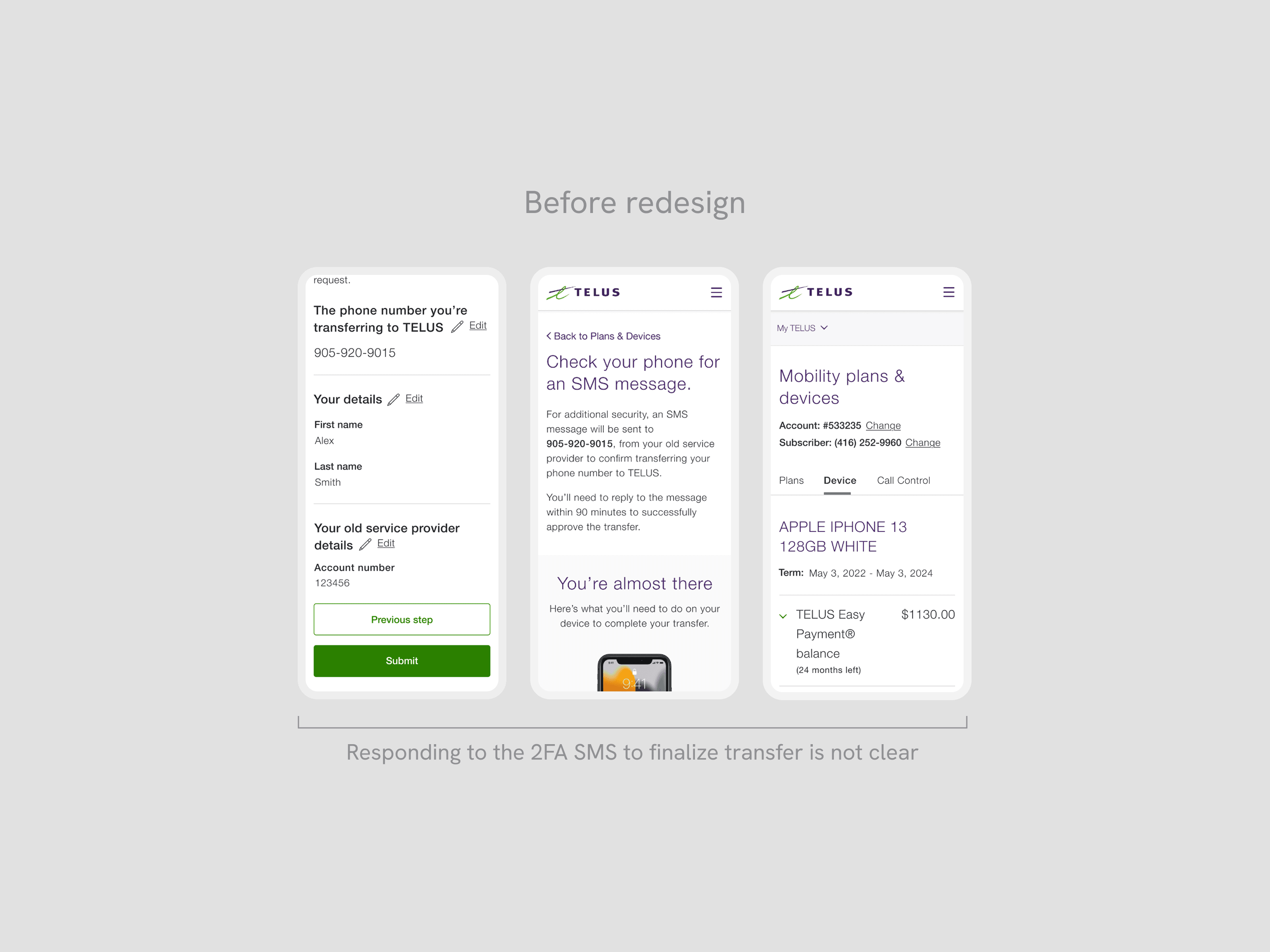
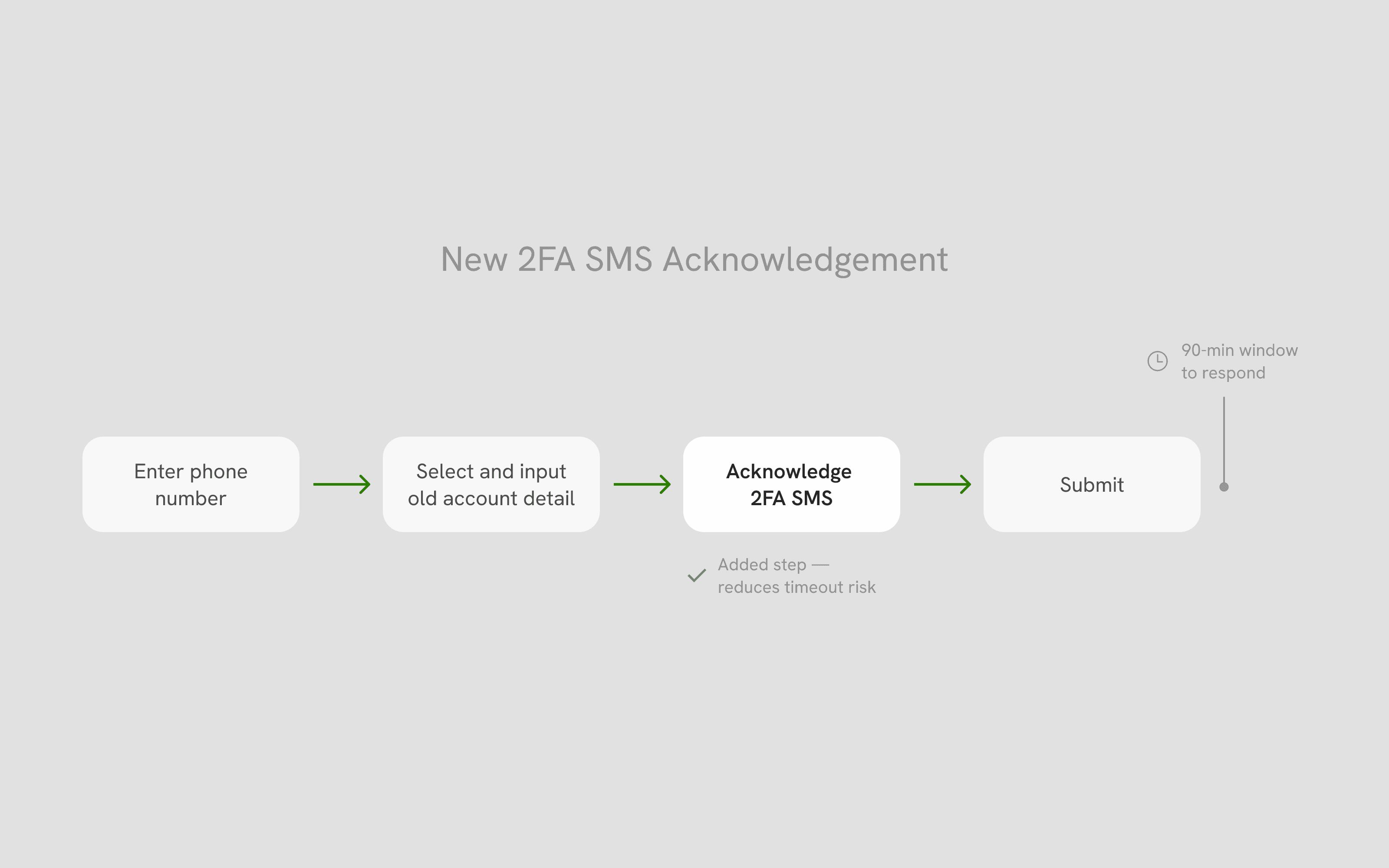
High number of timed out requests
When the 2FA SMS is sent, it requires user action within 90 minutes before timing out. Users did not understand the urgency of this next step, leading to timed out requests and a high number of support calls to remedy the timed out status.
Opportunity
Simplifying the transfer flow
By evaluating the existing user flow and drop-off rates, the biggest pain point was clear: customers were dropping off at the service details input step, either because they had chosen the wrong input type on the previous screen and had to backtrack, or because they couldn't locate the required information at all. This single friction point was responsible for a significant portion of abandonments.
From there, we focused our redesign on three things: reducing friction at the entry, input, and status stages of the flow; giving users more autonomy by allowing them to switch between input options without backtracking; and surfacing transfer status proactively to reduce support call-ins.
Process
Designing for task completion
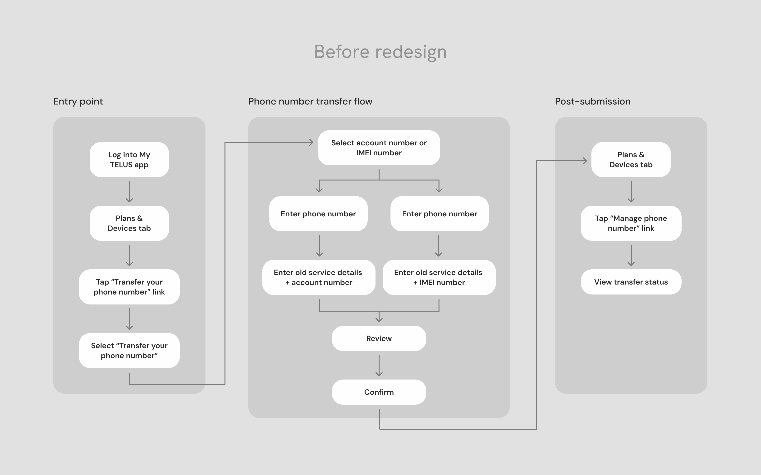
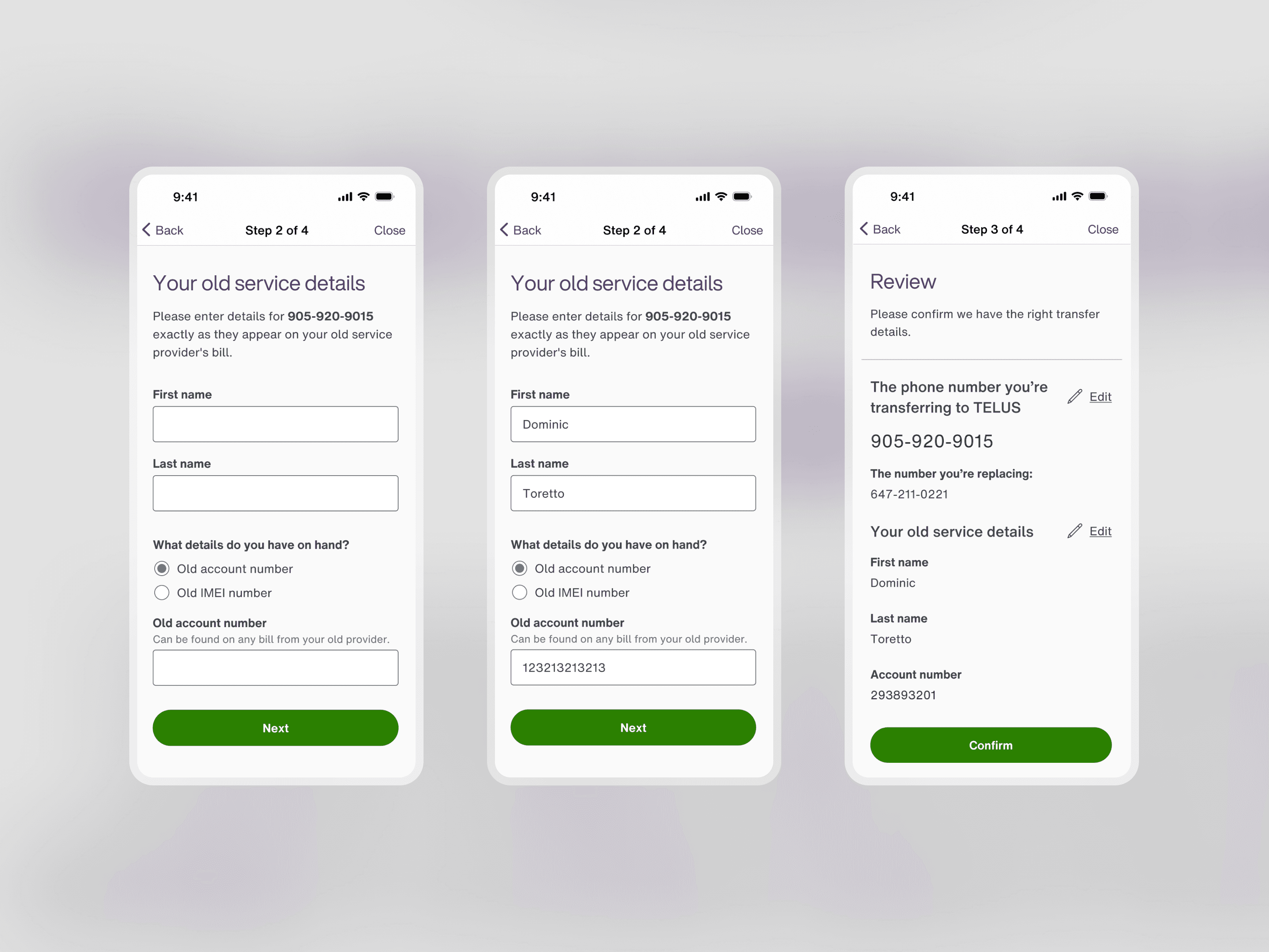
The web audit directly shaped two of our most important flow decisions. Analytics confirmed that the biggest drop-off occurred at the old service details input, where customers had to provide an old account detail that they selected two steps back. Separating selection and input across three steps meant that customers who chose the wrong option had to backtrack. We consolidated both actions onto a single screen, giving users the ability to switch input types without losing their progress.
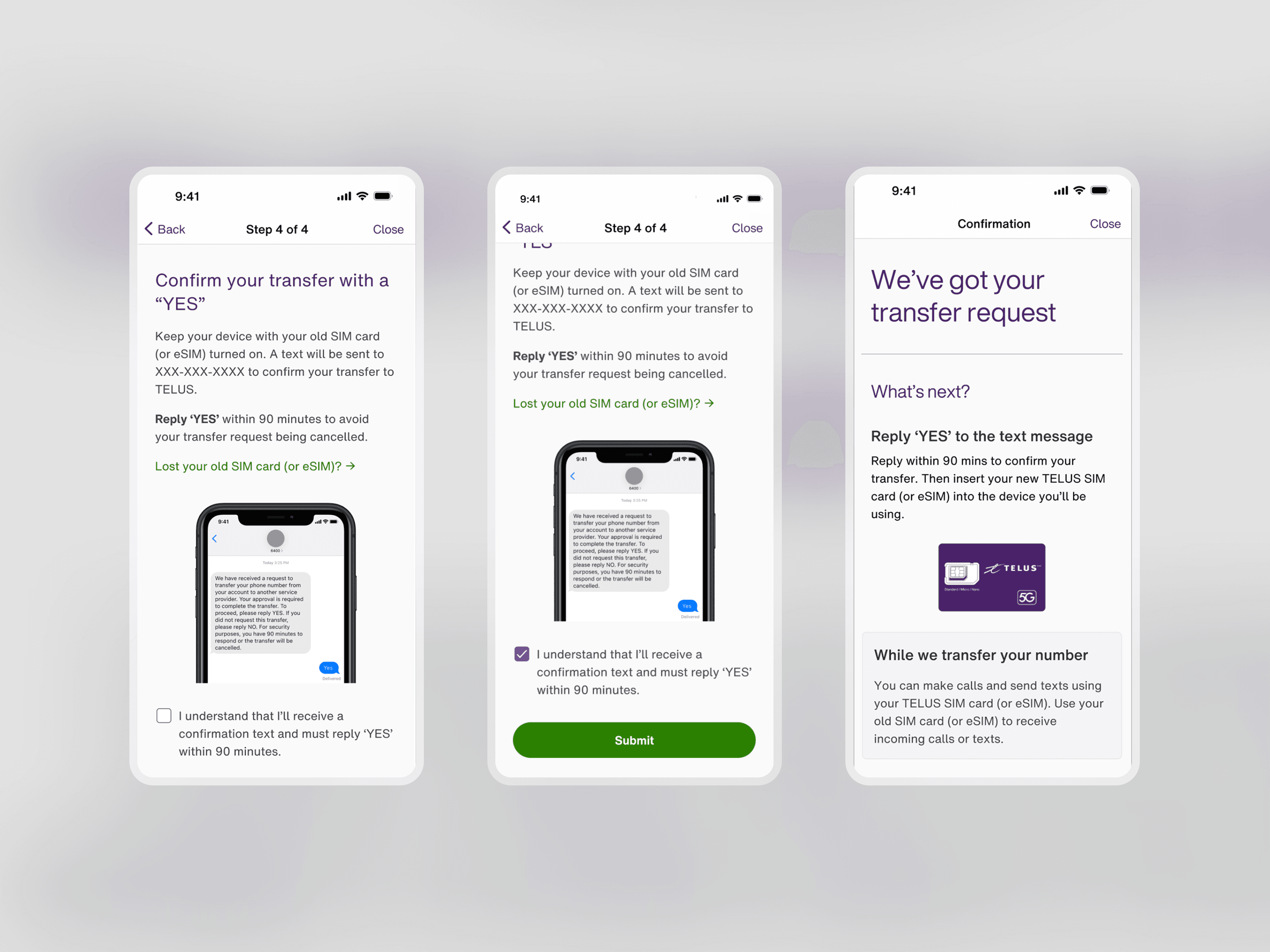
The second decision was more deliberate and required stakeholder buy-in. UX principles generally recommend fewer steps to reduce cognitive load, but our data showed that a significant number of transfers were timing out because customers missed the 2FA SMS after submission. We made the call to add an acknowledgement step, requiring customers to check a box confirming they understood the upcoming SMS and the 90-minute window to respond. The added friction was minor compared to the boost in completion rates it delivered.
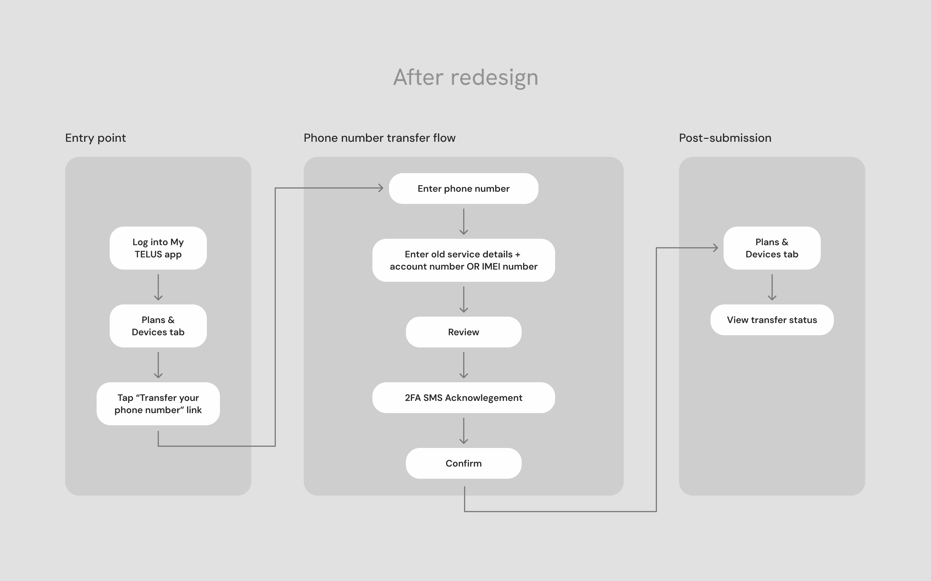
Final designs
Final launched designs
As the first My TELUS app experience to be redesigned in React Native, the final designs both improved the usability and performance of the application.
Reducing load time and friction to start
By creating a native in-app flow, the load time to enter the experience decreased from 15 seconds to ~2 seconds, while the number of taps to enter the flow was reduced from 3 taps to 1 tap.
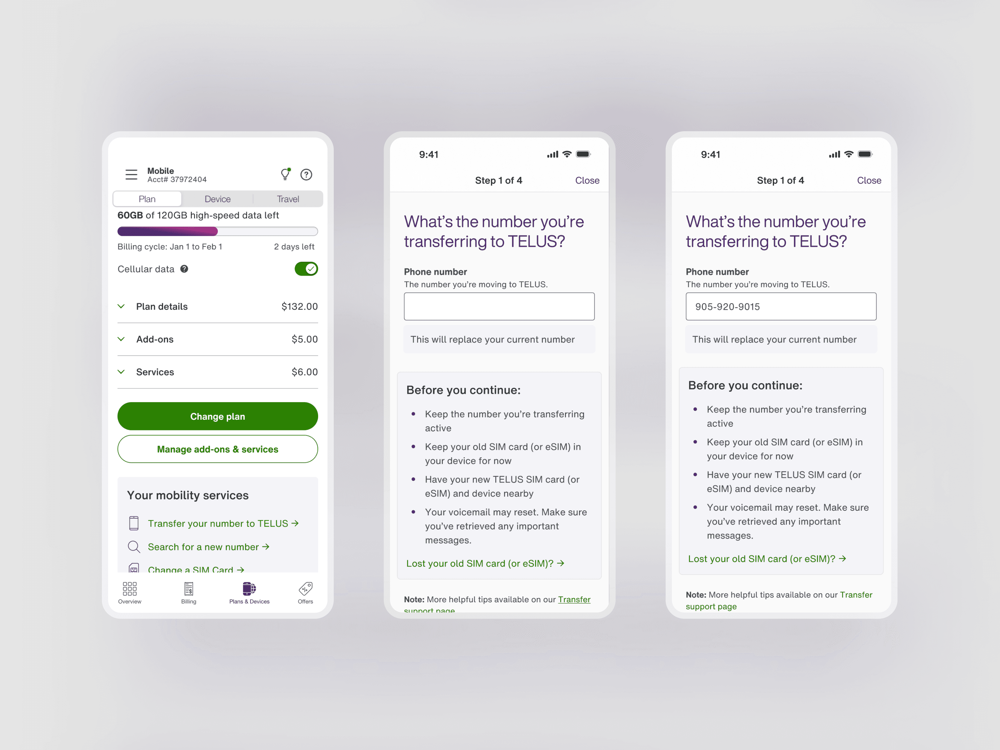
Check for number eligibility upfront
By moving the phone number checker to the first step, we can surface their eligibility on step 1 and upon any errors, can provide detailed error handling earlier in the experience.
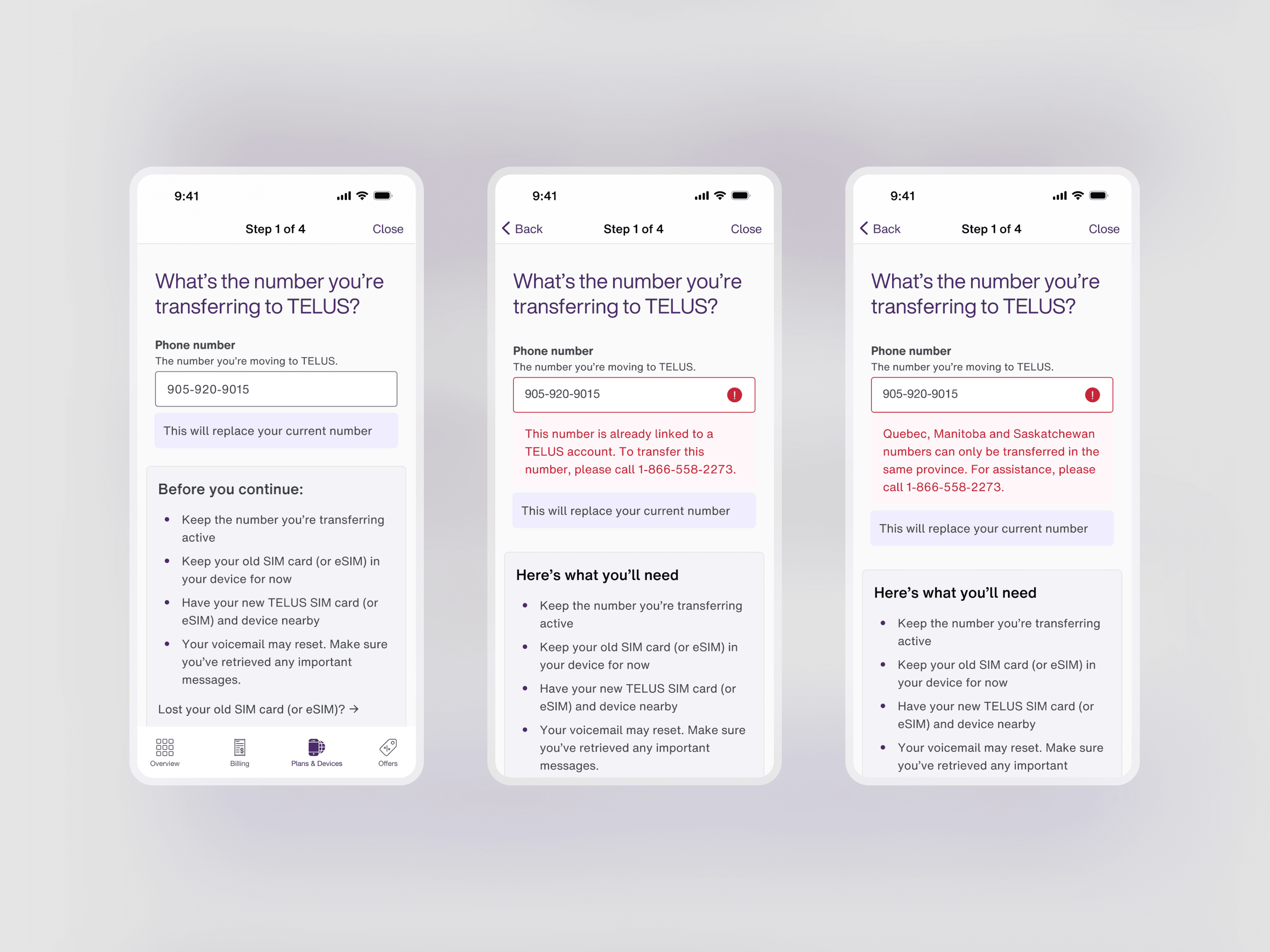
Simplify the necessary inputs
We revised the content to help customers find their old service details by referencing their old service bills from their previous provider. Customers can choose between different service details to provide, allowing them to adapt with the information they have on hand.
Leveraging analytics, we used old account number as the default selection, due to the higher selection and success rate.
New 2FA SMS acknowledgement
A new step was added where users must acknowledge the upcoming 2FA SMS through a checkbox before submitting their transfer. Previously, this instruction was given in the Confirmation screen, causing many users to miss the SMS and time out of the transfer period. By ensuring customers read and check the box, we increased the rate of successful transfer.
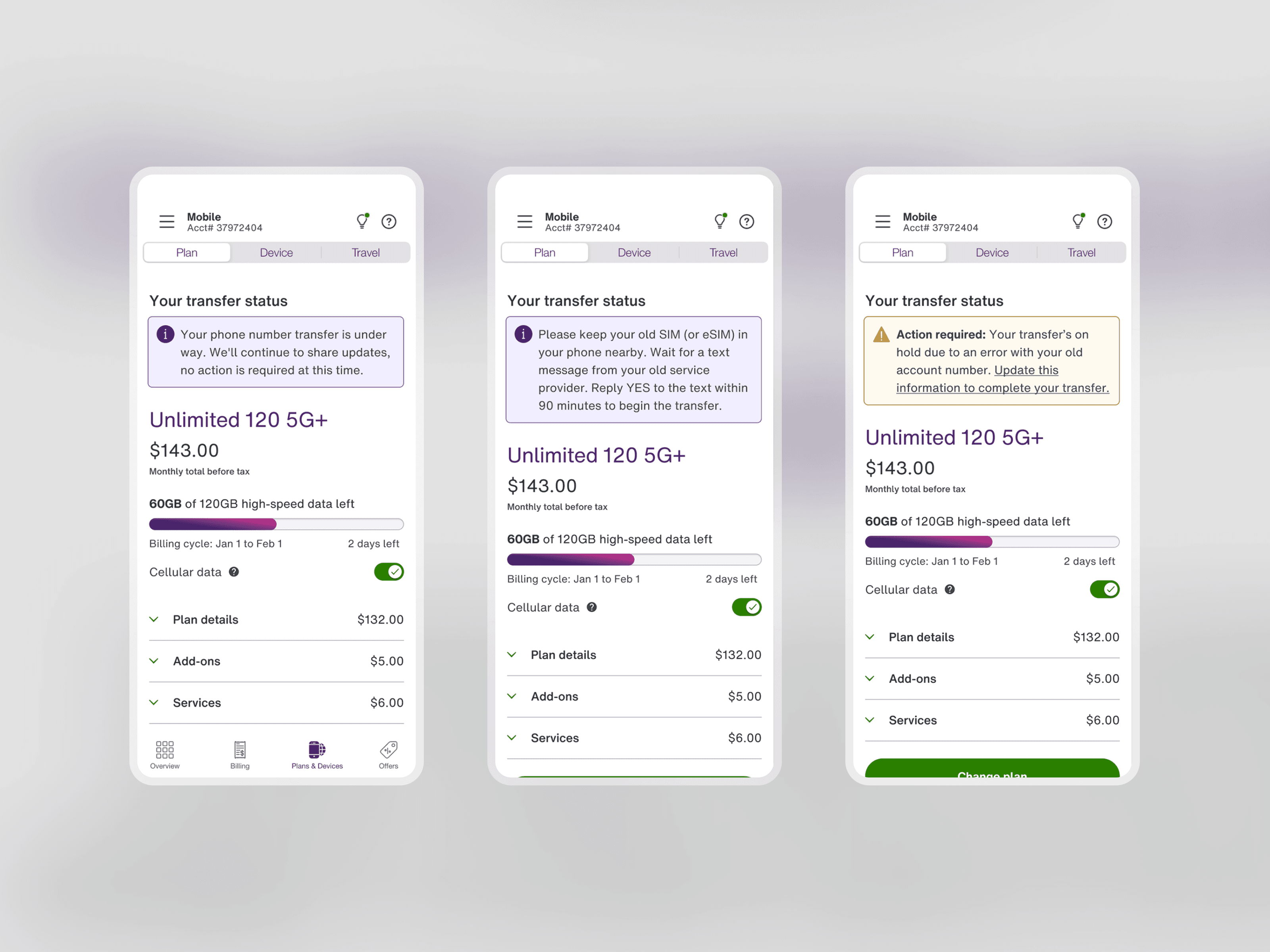
Dynamic status updates
Users previously had to view their status by selecting into the Transfer flow again. As new customers await their service transfer, we decided to surface these messages on the main app tab. This prevented re-entries into the flow, as well as call-ins for service agents.
Takeaways
Key takeaways
The most complex part of this project was mapping every error and status code across the phone number validation and transfer statuses. Each state needed to be visible, clearly worded, and actionable to the user, which required close collaboration with the Product Owner and Content Writer to ensure no edge case left a customer without a clear next step.
Looking back, I'd push for dedicated user research both before and after the redesign if budget allowed. The web audit gave us a strong foundation, but some scenarios were difficult to validate through analytics alone, like how customers respond when they can't locate their old account number on an old bill, or how they react to the urgency of a 2FA SMS in a real-world setting.