Overview
Mobility Phone Overview
A complete design and information architecture redesign to create a new consolidated overview page for users to view and manage their mobility accounts to improve findability for self-serve information and actions.

Year
2025
Project type
Responsive web
Client
TELUS
Introduction
Making it easier for customers to self serve
TELUS mobility users currently access information about their plans and device actions in a fragmented user experience. Currently, tabs separate the information structure and other key account info—like data usage and roaming—resides elsewhere, reducing efficiency. The page was one of the last legacy pages using the outdated TELUS Design System.
As the Lead Designer, I drove the IA strategy — mapping the legacy tab structure, exploring multiple organizational models, and converging on a single-page module approach after validating that tabs were the root cause of findability failures. Working with a Content Strategy Lead and researchers, I designed the usability testing and presented the new direction to stakeholders across the mobility experience to get alignment before moving to high-fidelity.
Impact
Overwhelming majority preferred the redesign
While post-launch analytics tracking was not scoped for this project, the usability testing with 21 different users demonstrated improved task performance and a strong user preference for the redesign.
78% of users preferred the redesigned experience
80% of users mentioned that surfacing both plan and device on the same page was simpler to understand
100% of users found device information on the page, compared to 42% of users that struggled in the legacy design.
Problems
Findability issues with managing their account
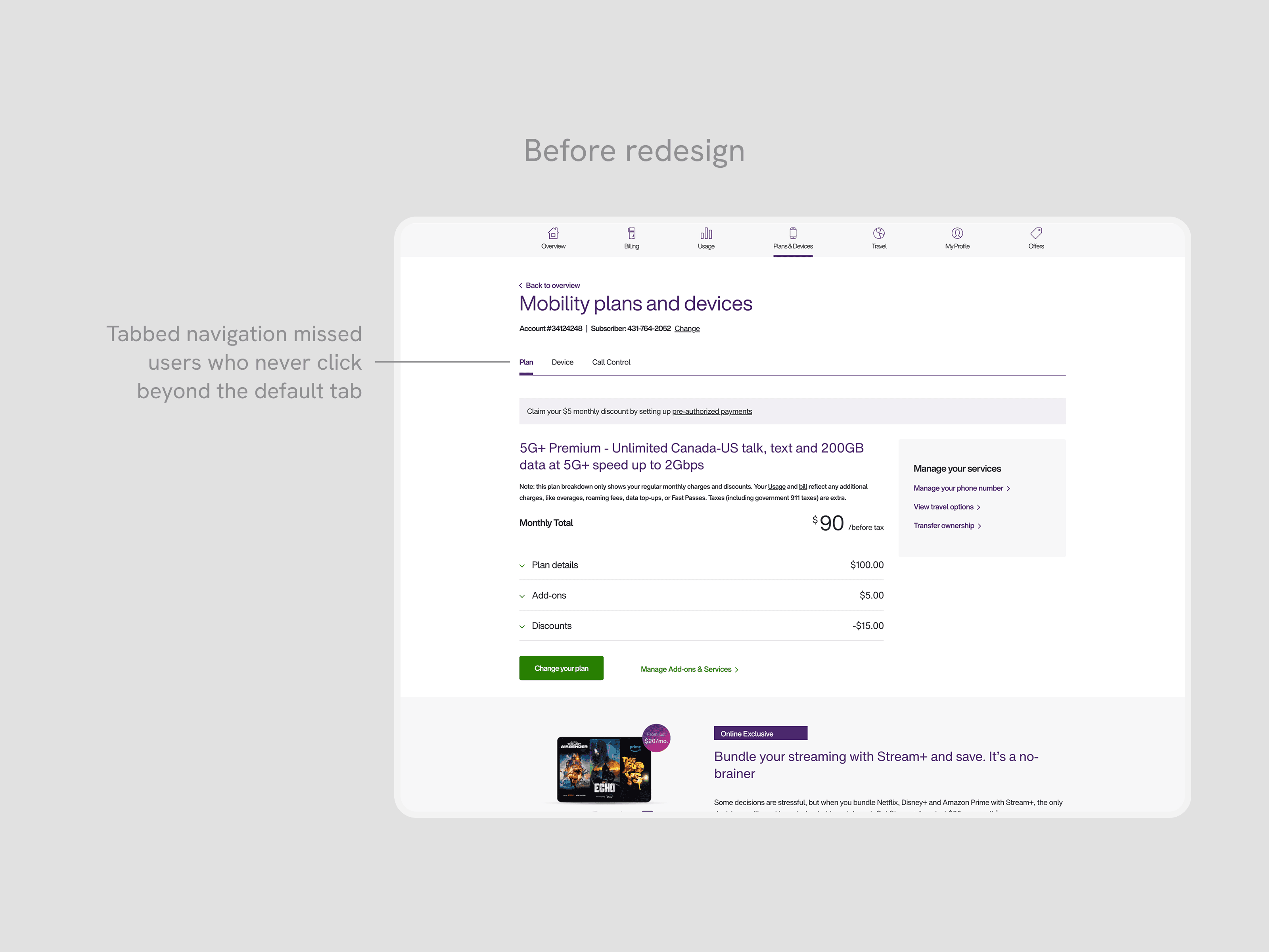
Past user interviews completed for the My TELUS pages revealed that users visiting the Plans & Devices page often overlooked tabs, delayed locating actions, and felt frustrated by outdated visuals.
Poor information architecture for information and actions
Customers missed the tabs, or wanted to see information earlier without adding more clicks to see key information.
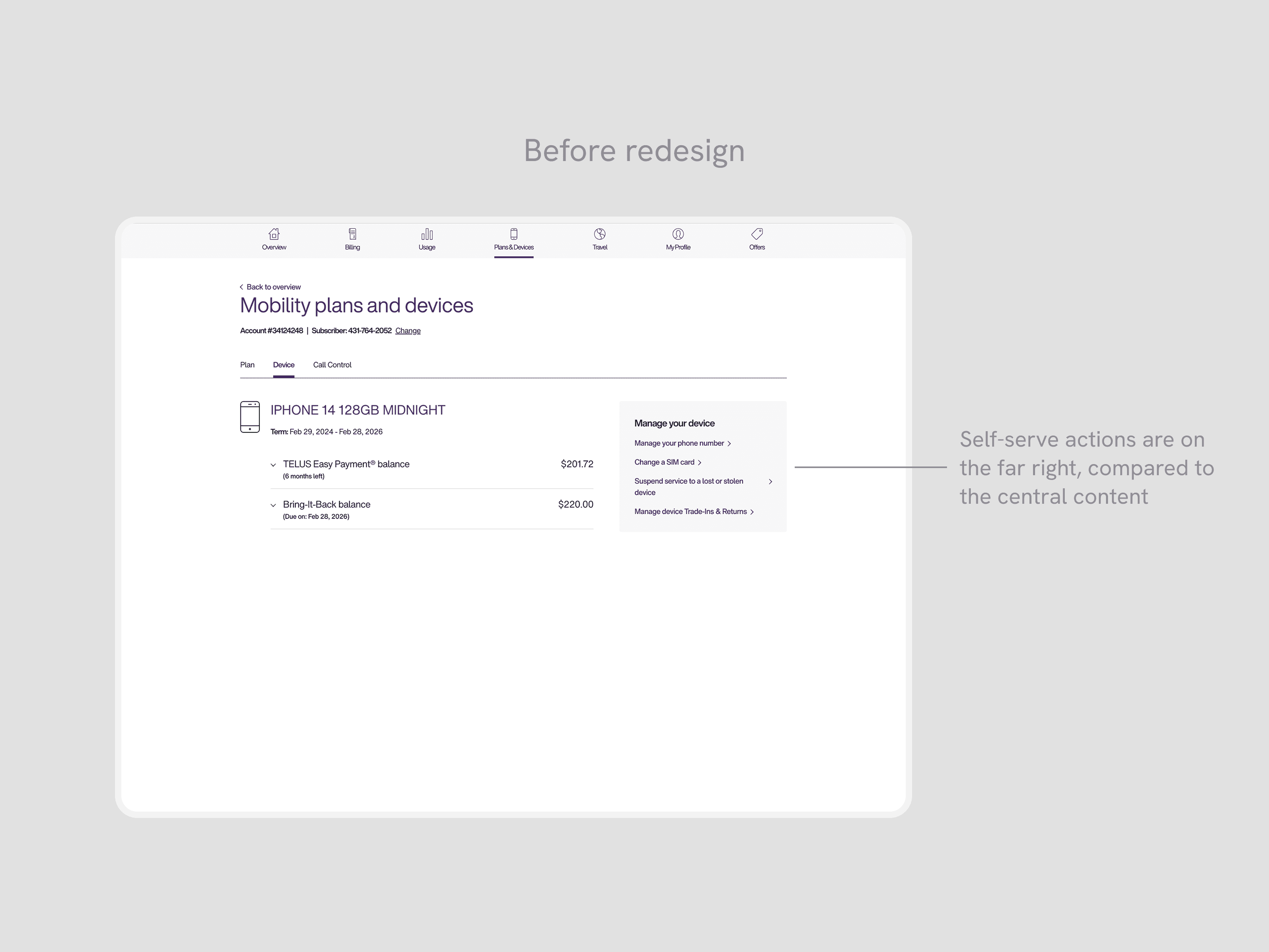
Key self-serve actions are not findable for users
Key self-serve flows are grouped outside of the main area where users looked, creating friction in finding entry points.
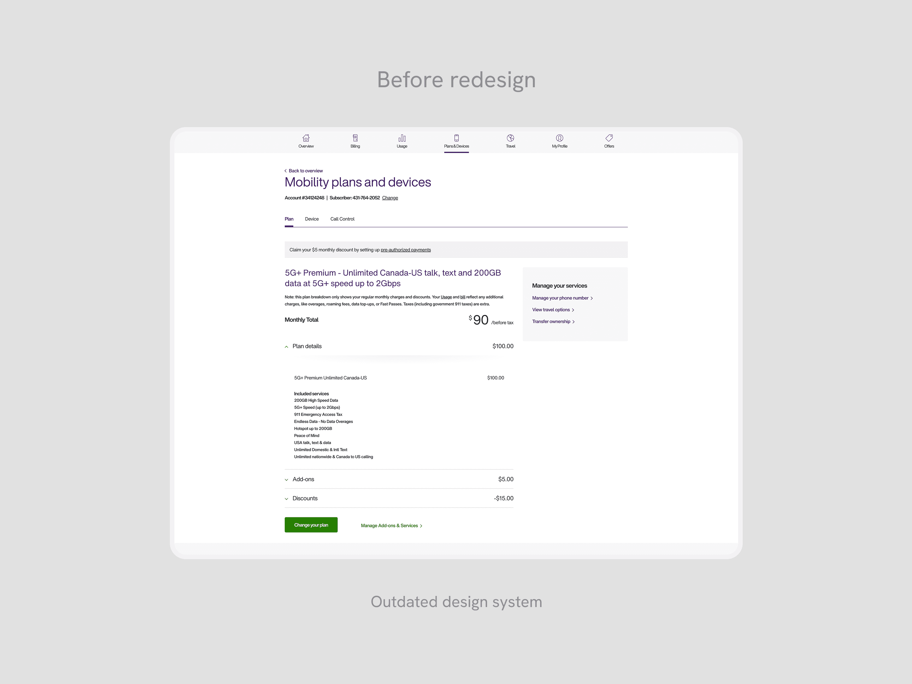
Outdated design system
The Plans & Devices leverages the old TELUS Design System, resulting in dated visual branding and user interactions.
Opportunity
Creating a new mobility hub
By leveraging these user insights, our main goal was to improve efficiency for customers looking to review and manage their mobility account. This meant reducing the effort and clicks required to find key account information, improving the findability of self-serve actions that were previously buried or hidden, and upgrading the interface to the new TELUS design system for platform consistency.
Explorations
Moving from tabbed pages into modules
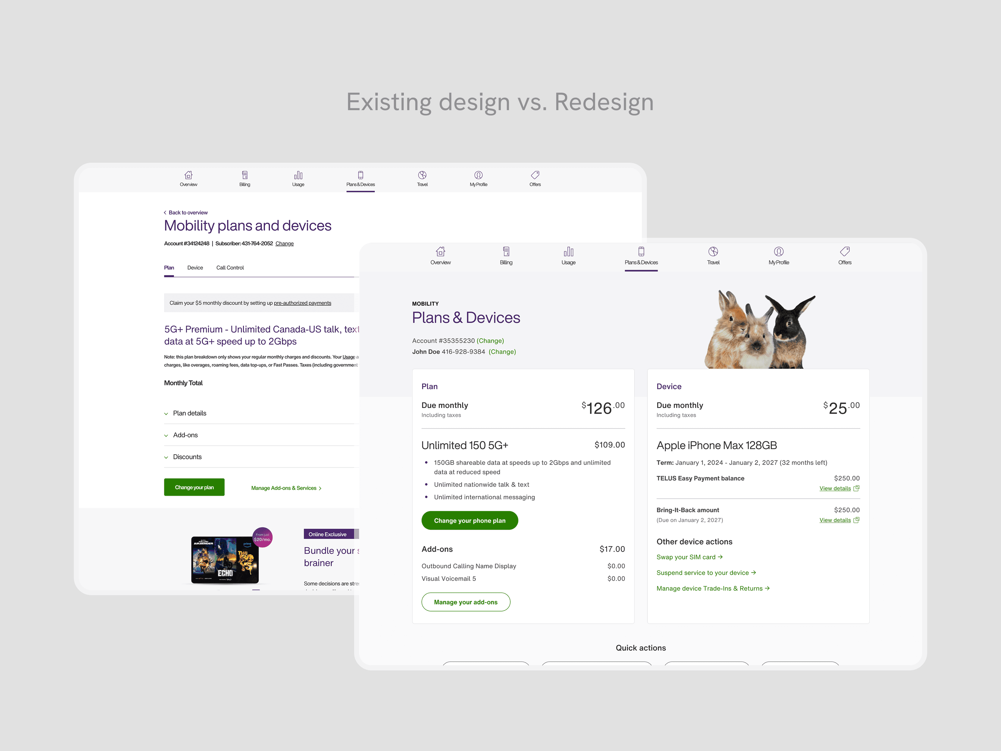
Our redesign explored three architectural directions. The legacy experience used tabs to separate mobility areas, which user research confirmed caused users to miss key information entirely. Our first exploration moved to a main overview page with separate sub-pages for each mobility area — this improved high-level visibility, but replicated the same core problem: users still had to navigate away from the overview to complete self-serve actions, adding friction and clicks.
Our second exploration consolidated everything into a single-page layout with grouped modules and modals — keeping high-level information visible while letting users drill into detail without leaving the page. This addressed both findability and effort. Stakeholders across the mobility experience shared the same concern about friction, which helped align quickly on this direction. We then refined to high-fidelity and validated through an unmoderated A/B test with 21 users.
Final designs
A clear overview for anything mobility-related
By clearly surfacing information and self-serve actions, customers can now find account information and self-serve actions in a single, familiar yet redesigned page.
Above-the-Fold clarity
Aligning with the name of the page, users can see both their plan and device information simultaneously. These are the key high-level sections that customers look for when landing on the page. With our new sections, related self-serve actions are grouped accordingly, making it intuitive for users when managing their plan and device.
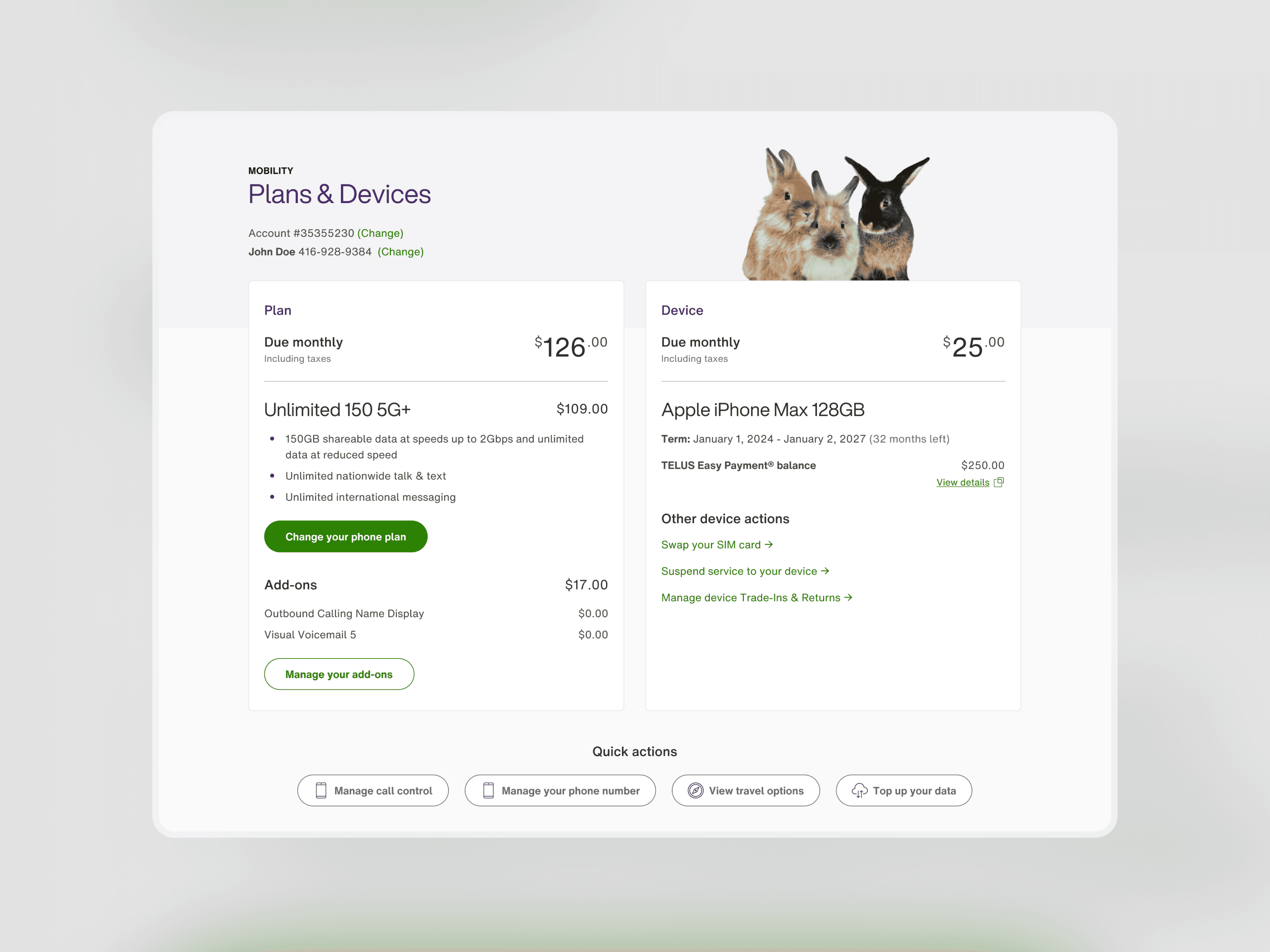
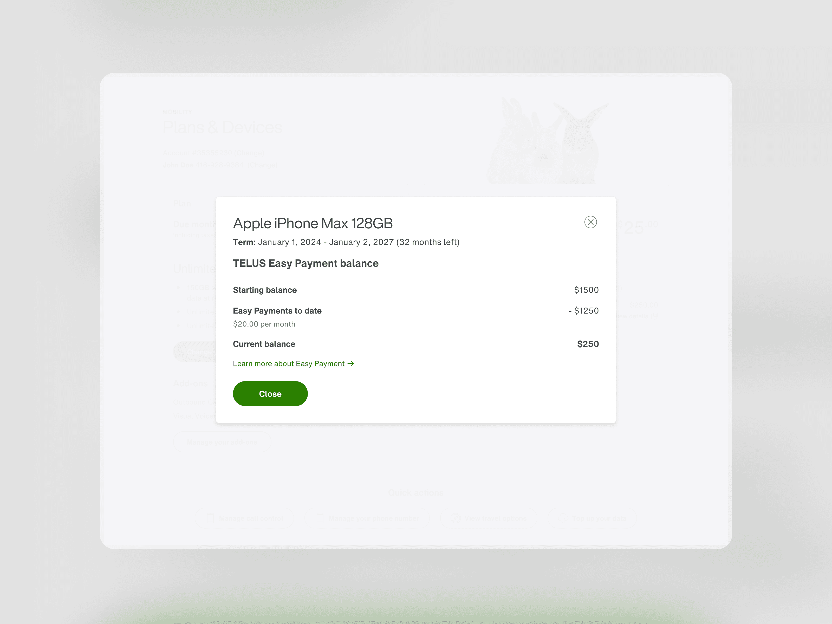
Reducing cognitive load with modals
To reduce cognitive load and visual clutter, the important high-level information is displayed on screen and modal links give users the option to view more details. When opened, the modals will highlight more detailed explanations and breakdowns of their plan, and device financing.
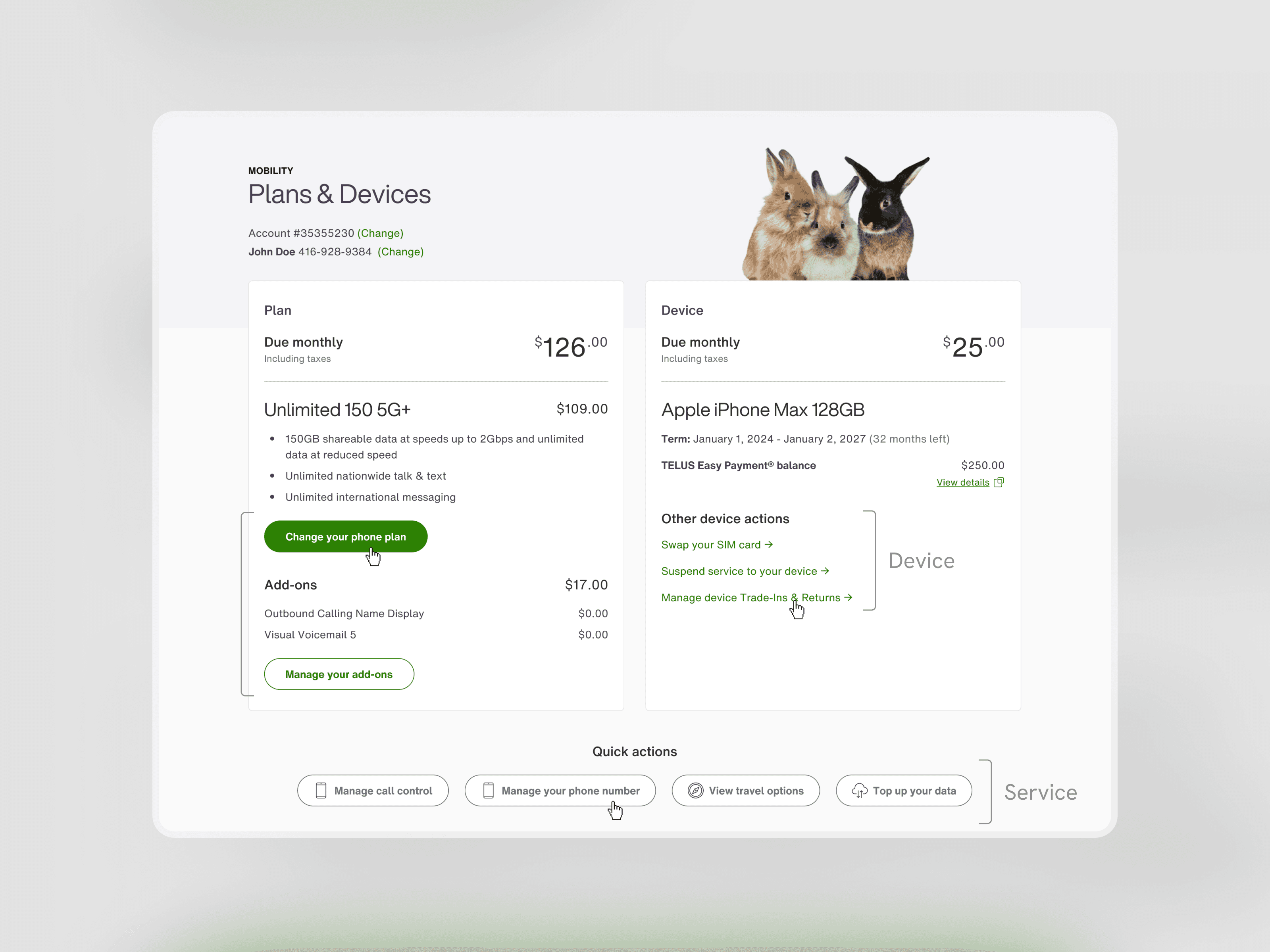
Logical grouping for self-serve actions
The self-serve actions are grouped within the plan or device section in order to keep related information and actions together. Any self-serve actions that are more generalized or rarely used are grouped together in the Quick Actions section in the center of the screen. With the position and iconography, the individual links stand out within the page.
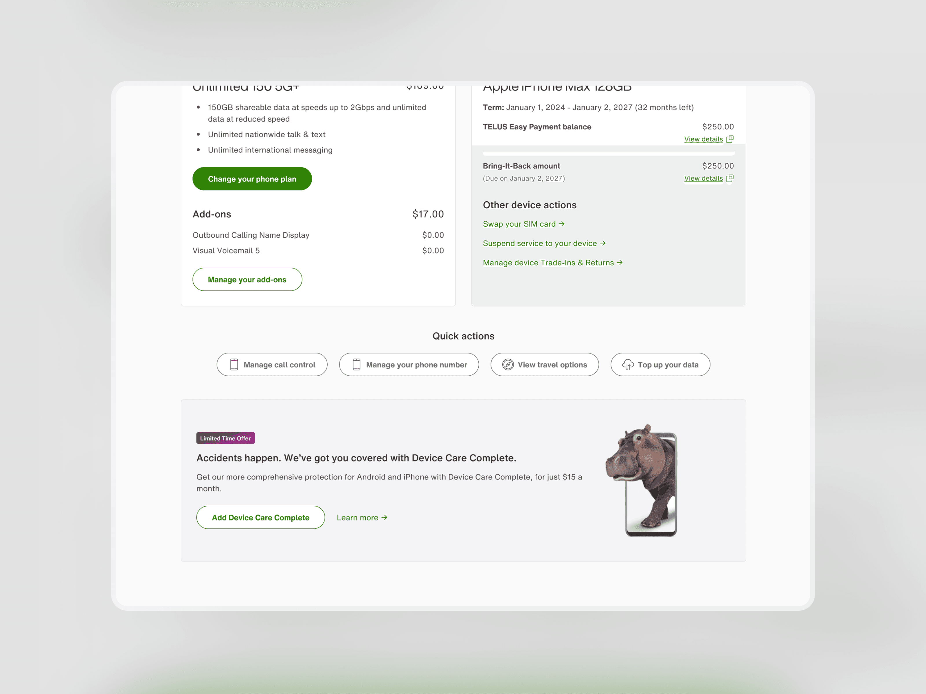
Promoting offers
At the bottom of the page, we created a dedicated space for promotions, which was a stakeholder priority for revenue generation. Positioning it below the self-serve content ensured it didn't compete with the primary tasks users came to complete, while still being able to surface time-sensitive offers to customers already engaged with their mobility account.
Takeaways
Key takeaways
The most unexpected challenge was the blue-sky brief itself. With full creative freedom to rethink the page, the hardest part wasn't buy-in; it was iterating without a prescribed direction, which required experimentation and a reliance on testing validation.
The other major complexity was managing edge cases across API states. A single module could surface notifications from phone number transfers, financing updates, or service suspensions — each requiring its own designed state. Staying closely connected with program owners was essential to ensure no user landed on an undesigned scenario.
Looking back, I'd push for post-launch analytics tracking from the start. Our usability testing results were strong, but tracking time-on-task or the number of self-serve action entries in the live product would have validated whether the redesign performed as expected beyond the test environment.