Overview
Device Returns
The Device Return product allows customers to return their contracted device for a credit when upgrading to a new phone. I designed the new flow, enabling customers with contracts to seamlessly opt-in, assess their device, and apply their credit before they hit the cart.

Year
2025
Project type
Mobile app
Client
TELUS
Introduction
Receiving a credit for a new device
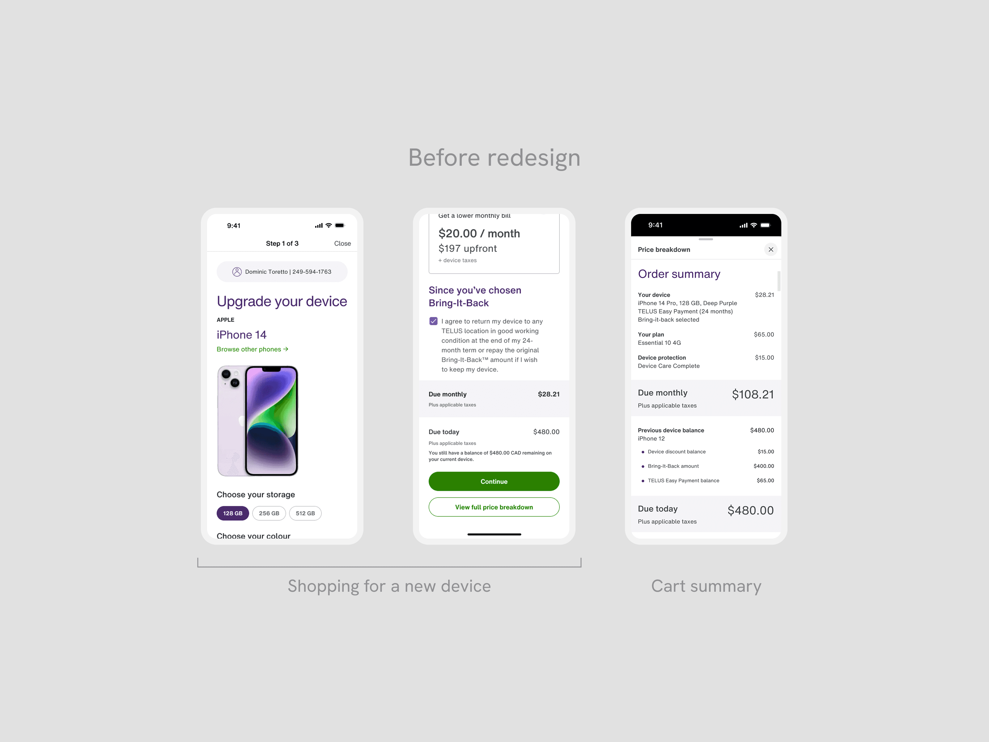
As TELUS customers are nearing the end of their contract, they look to upgrade to the newest devices. In the existing app flow, customers with contracts are forced to pay off their devices, preventing them from returning the device to TELUS for a credit unless they start the flow on the web.
As the lead designer, I owned the end-to-end UX and interaction design of the device return flow, enabling customers to get a credit for their existing device and incentivizing upgrades plus device returns for the company.
Impact
Increased number of upgrades with a device return credit
By adding this flow, we included a large segment of TELUS customers who may have otherwise failed to upgrade if they were charged their existing device price.
1,285% increase in funnel velocity by accommodating device return customers
14x improvement in completion rates from legacy experience
1,226% increase in customers reaching the cart to checkout (0.042% to 5.57%)
Problems
Customers are forced to pay off their device
The existing app flow did not give customers the option to return a financed device, forcing them to pay off their device while purchasing a new phone.
Sticker shock when shopping
Because customers forgot about their financed device and are not given the option to return it, the sticker shock of seeing a charge causes users to drop-off while shopping. Ultimately, this reduces the potential revenue that the business can earn.
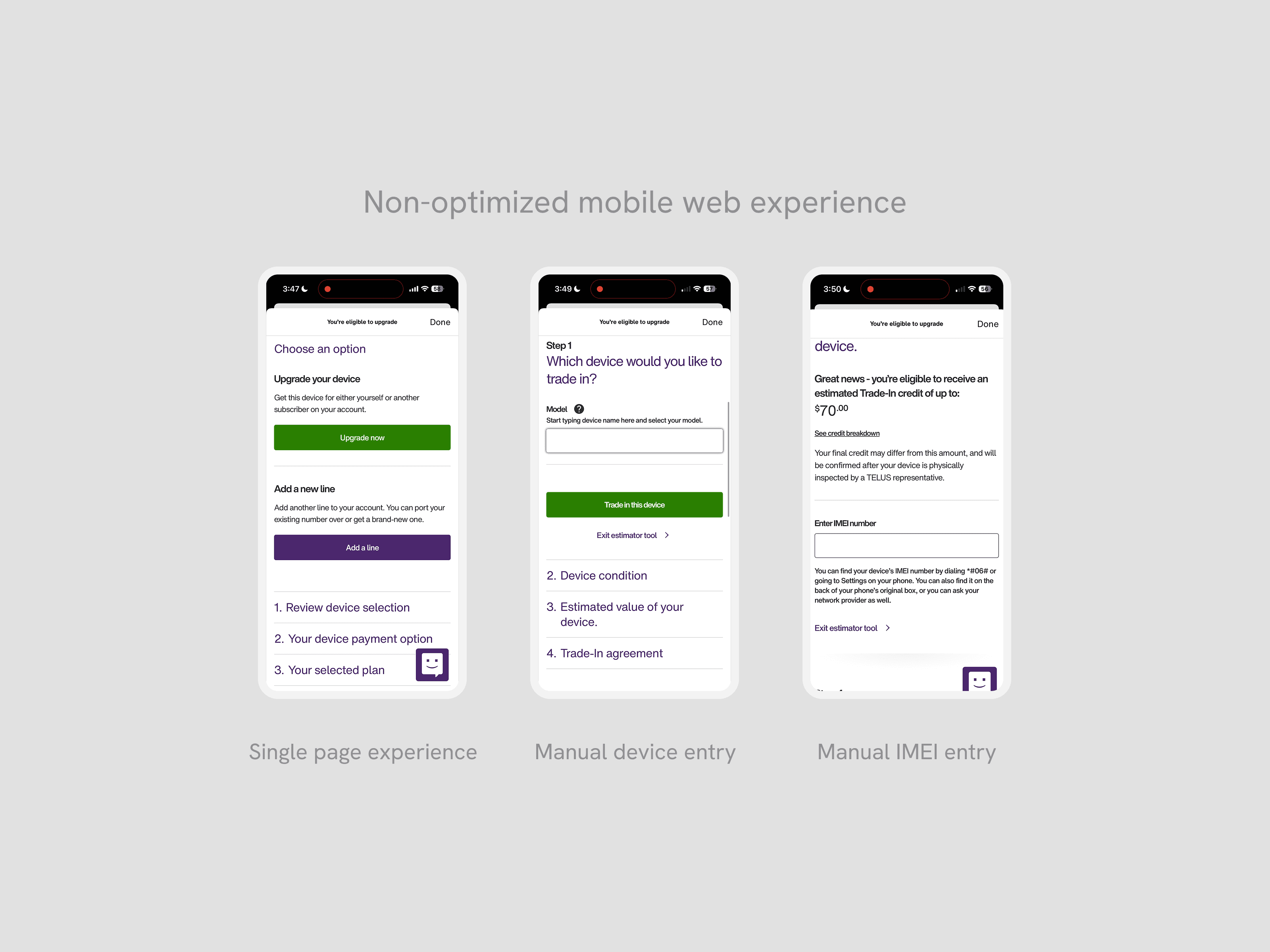
Dependence on mobile web flow
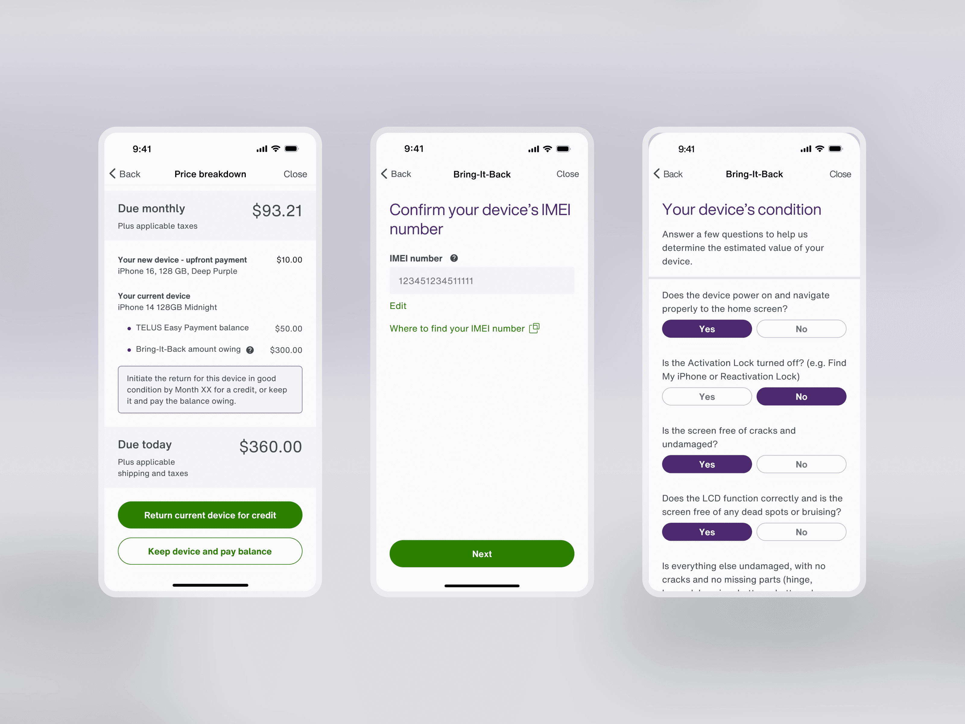
If customers wanted to return their device, they had to open the mobile web flow which was not optimized for returning their device. The multi-step journey is on one page, and customers have to manually select their financed device and its IMEI number.
Opportunity
Making it seamless to evaluate phone for credit
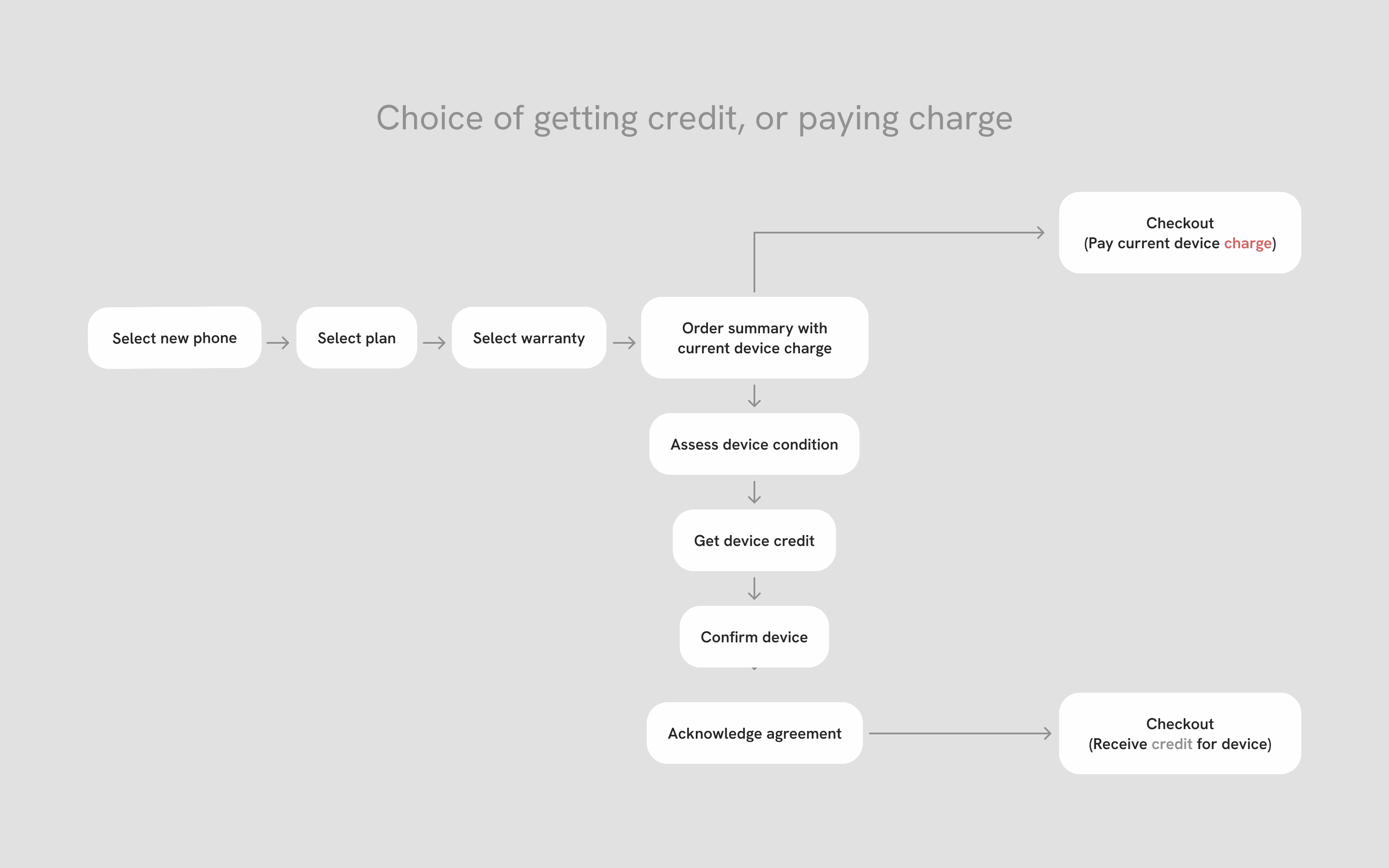
At the point where a customer would otherwise be forced to checkout with an unexpected charge, we introduced a new path allowing them to return their device for a credit. Our design focused on reducing the mental effort of the process by pre-populating device information so users didn't have to recall it themselves, giving transparency into how their device condition affects credit value, and ensuring customers felt confident about how that credit would reduce their final purchase price before reaching the cart.
Process
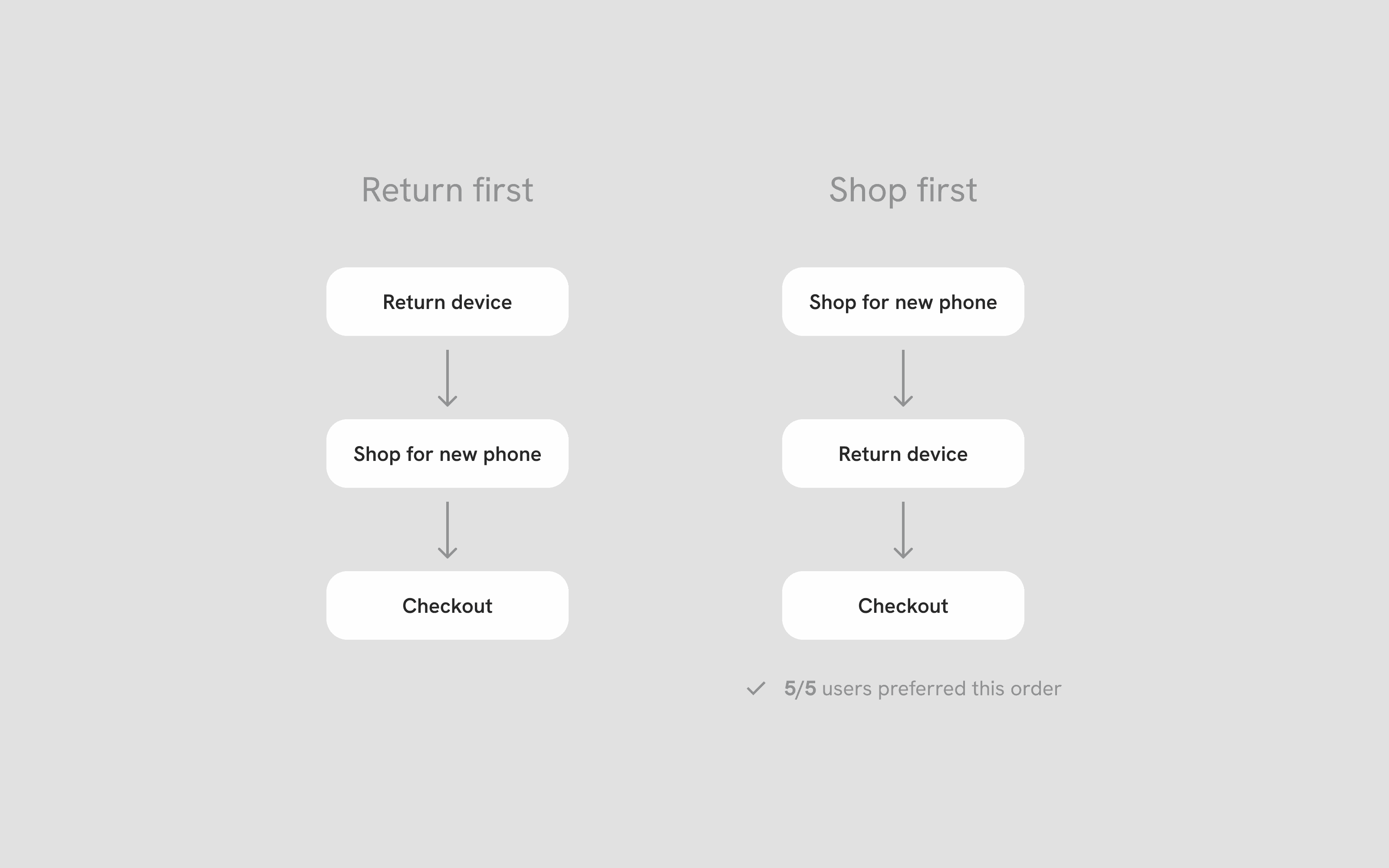
Determining the point of least friction
During discovery, we had to decide whether to give users the option to return their device before or after shopping for a new one. Because shopping was already a multi-step experience, I wanted to minimize the friction of adding another set of steps mid-flow.
To validate quickly, we conducted guerilla testing with TELUS team members outside of the My TELUS team. Walking through both flow orders, all 5 participants overwhelmingly preferred to shop first, which gave us a clear sign we carried directly into our final design.
Final designs
Final launched designs
By creating a seamless flow that highlights the opportunity to get credits, customers who are financing a device are able to feel incentivized to upgrade.
Highlight return option and make it easy
Once customers configure their new device, we surface two clear CTAs — one to apply a device return credit, one to skip. While some users prefer to keep their current phone, the majority would rather offset their remaining balance with a credit. To reflect this, we styled the return CTA in our primary colour to increase visibility and guide users toward the higher-value action without removing their choice.
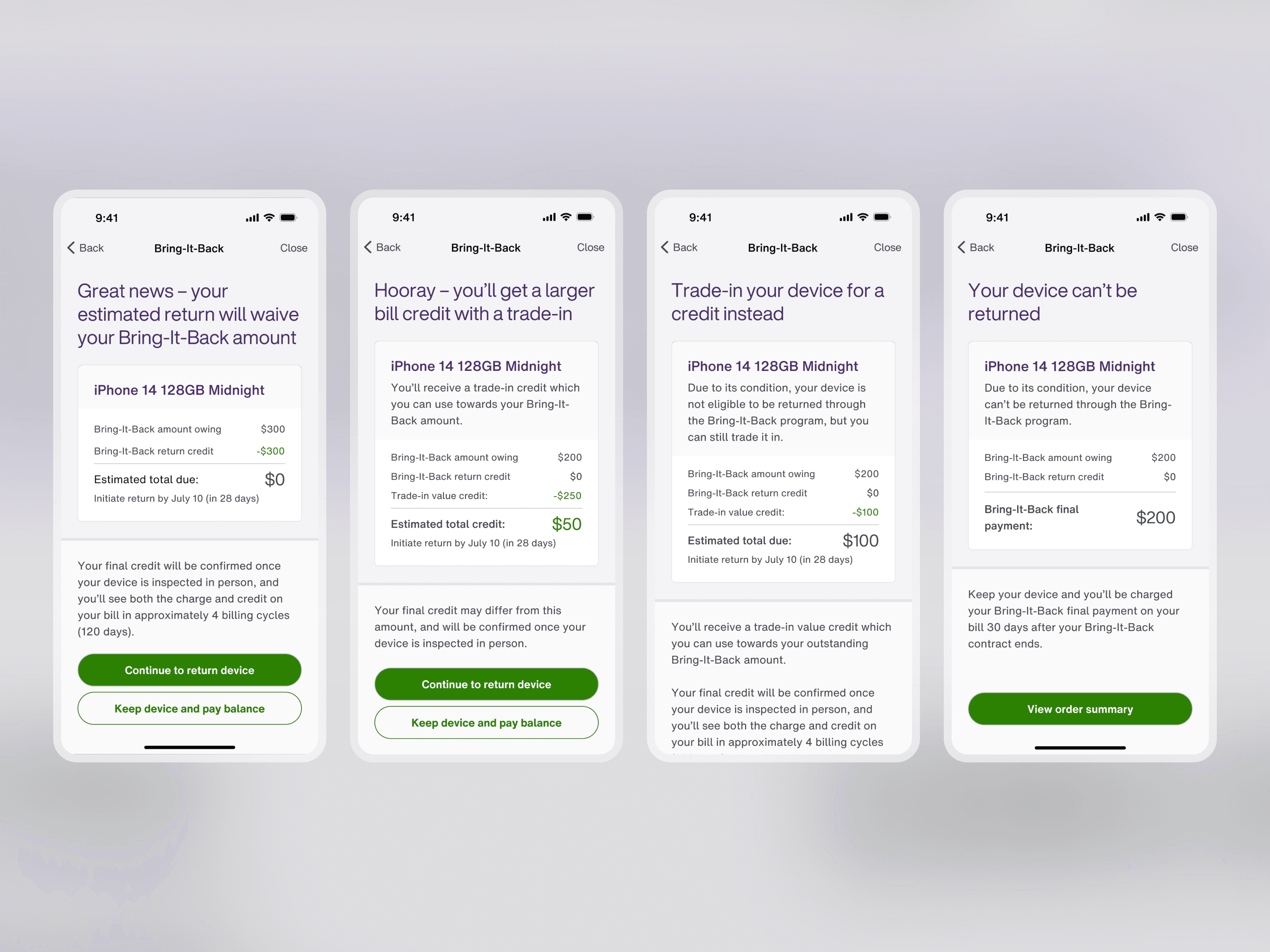
Communicate results and break down the math
Early versions of the results screen showed only final credit amount. During testing, it caused users confusion because they didn't understand how the number was calculated or what it meant for their purchase. Based on that feedback, we moved to a line-by-line breakdown showing cost minus credit equals total amount owed or credited, giving users the transparency they needed to feel confident moving forward.
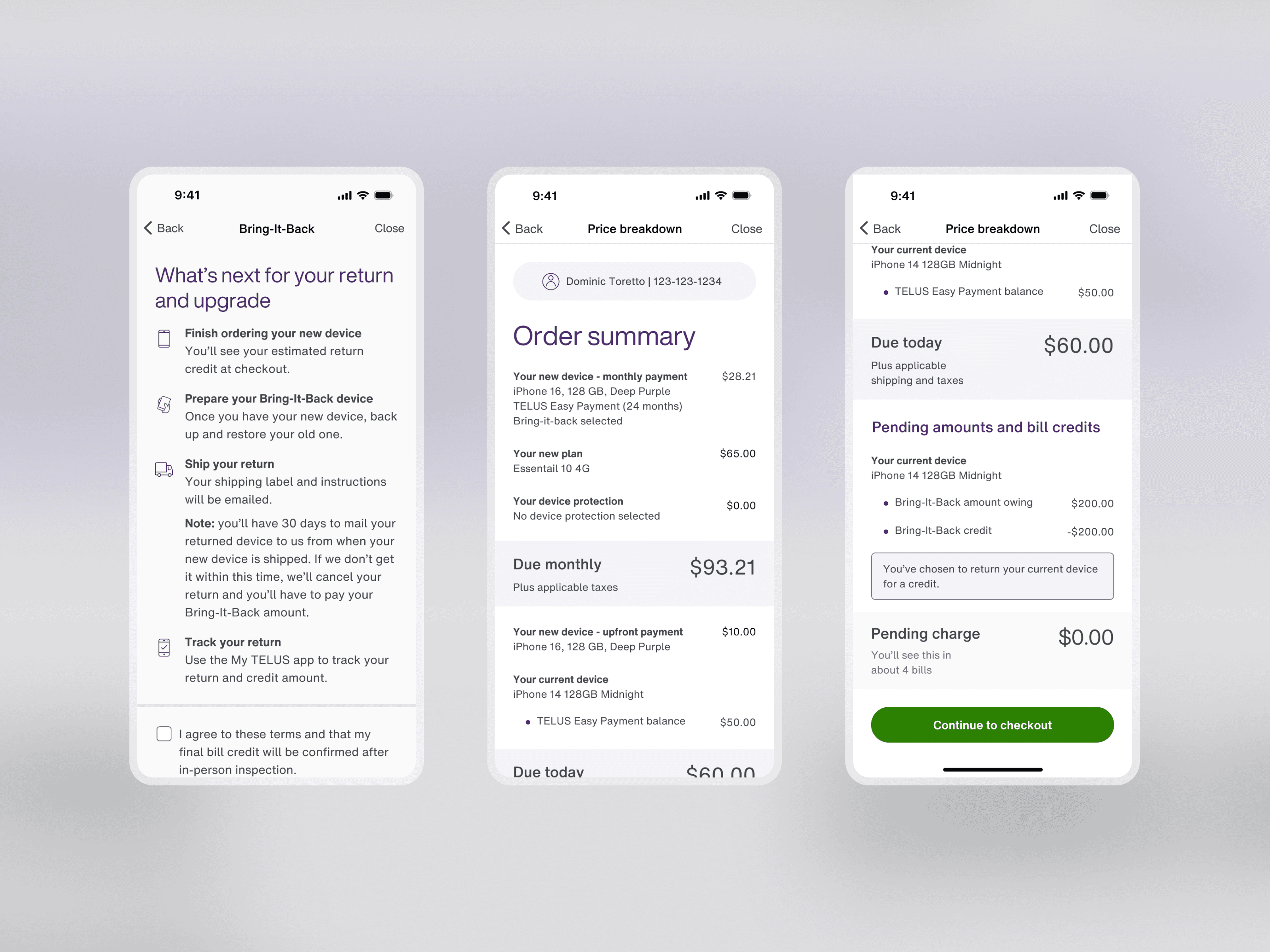
Clear next steps to apply to cart
The device agreement is a legal requirement, but we treated it as a design opportunity. By adding simple instructions around the legal acknowledgement, we ensured customers understood exactly what happens next, from how to ship their device back to how the credit is applied — reducing uncertainty before they committed to checkout.
Takeaways
Key takeaways
The most complex challenge in this project was the content. Customers generally agree to financing a device 2+ years prior to renewing, so communicating the device charge required careful and deliberate writing and design to remind users what they had committed to, how it affected their return value, and what completing the program actually meant. In this project, adding more content and screen real estate was necessary to both provide clarity and reduce confusion.
Looking back, I would have loved to start with discovery on the existing flow before designing the new path. I would observe where customers naturally expected a return or trade-in option to appear, rather than us deciding on where to introduce it. This would have let organic user behaviour inform the placement of the flow, which could have surfaced insights that testing two prescribed locations may have missed.